New Interstitial Templates In Action: Format Overview + Case Study
After the new Interstitial templates have been released, we got numerous questions about them and interstitial traffic in general.
So we decided to do a quick recap on this traffic type, add some useful stats, and share a comparison test of the new templates. Enjoy!
What’s an Interstitial format?
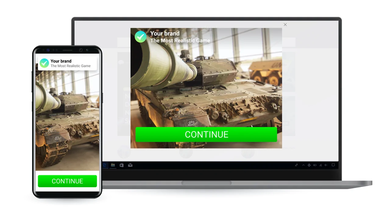
The Interstitial ad format includes a big image, a title, and a description that all can be customized. The ad appears over the website content with a small delay after a page is loaded.
You can use the format both for mobile and desktop traffic.
Interstitials VS. Other ad formats
In general, Interstitials are very clickable. They have a high click-through rate and eye-catchy big banners where you can apply all your creative ideas.
- If you are a dedicated Onclick/Popunder ads user, you will find the opportunity to bid by CPC really attractive. Producing the same powerful effect on a user, the format gives you the option to spend the ad budget only on those who are interested and click on the ads.
- Push ads-people will like a much higher CTR, that significantly widens your sales funnel and provides your offer with a bigger reach.
The killing feature is that Interstitial banners are big (up to 900×600), have nice CTR-boosting effects (especially the new ones, think: animation), and in some templates can take up all the screen space and provide the maximum visibility.
What to start with?
?️ Verticals:
Interstitials on mobile work miracles with Utilities, Sweepstakes, Finance, and iGaming. Expect good results with everything free and exciting: prizes, gift cards, bonuses, free spins, etc. On the desktop, our Interstitial is the king for Extension and Games of all kinds.
? GEOs:
The highest conversion rate is currently in the USA (US), Great Britain (GB), Saudi Arabia (SA), Myanmar (MM), Brazil (BR), South Africa (ZA), Malaysia (MY), India (IN)
Huge traffic volumes for scaling are in Mexico (MX), Indonesia (ID), Philippines (PH), Japan (JP), South Korea (KR), Germany (DE), Italy (IT).
? Traffic Prices:
The min bids for Interstitial traffic are: CPC from $0.001, CPM from $0,01
[Case study] Let’s compare the templates!
We asked one of our affiliate friends to test the templates. Here’s the feedback he shared:
Previously I had some decent results with the Interstitial traffic, but I didn’t find ways to scale them, and the format seemed less effective than the hyping Push.
In May 2020 when PropellerAds rolled out 4 upgraded templates, I got curious about getting back to Interstitials. For my test, I picked the Classic (old template), the new “Blur Dark”, and the “Prize”. The last one seemed especially promising with all that animation!
The offer and conversion flow
If you’re thinking of testing the new Interstitials yourself, keep in mind that you can’t combine different templates in one campaign, so you’ll have to create a separate campaign for each template. Just like I did.
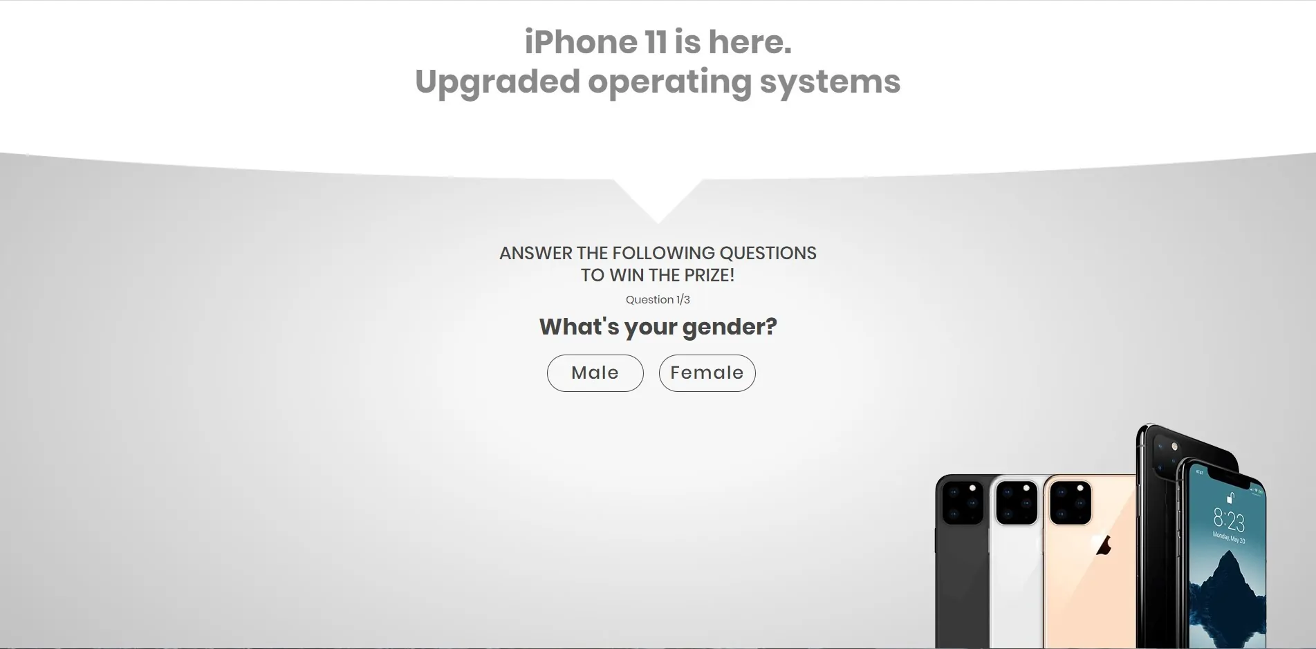
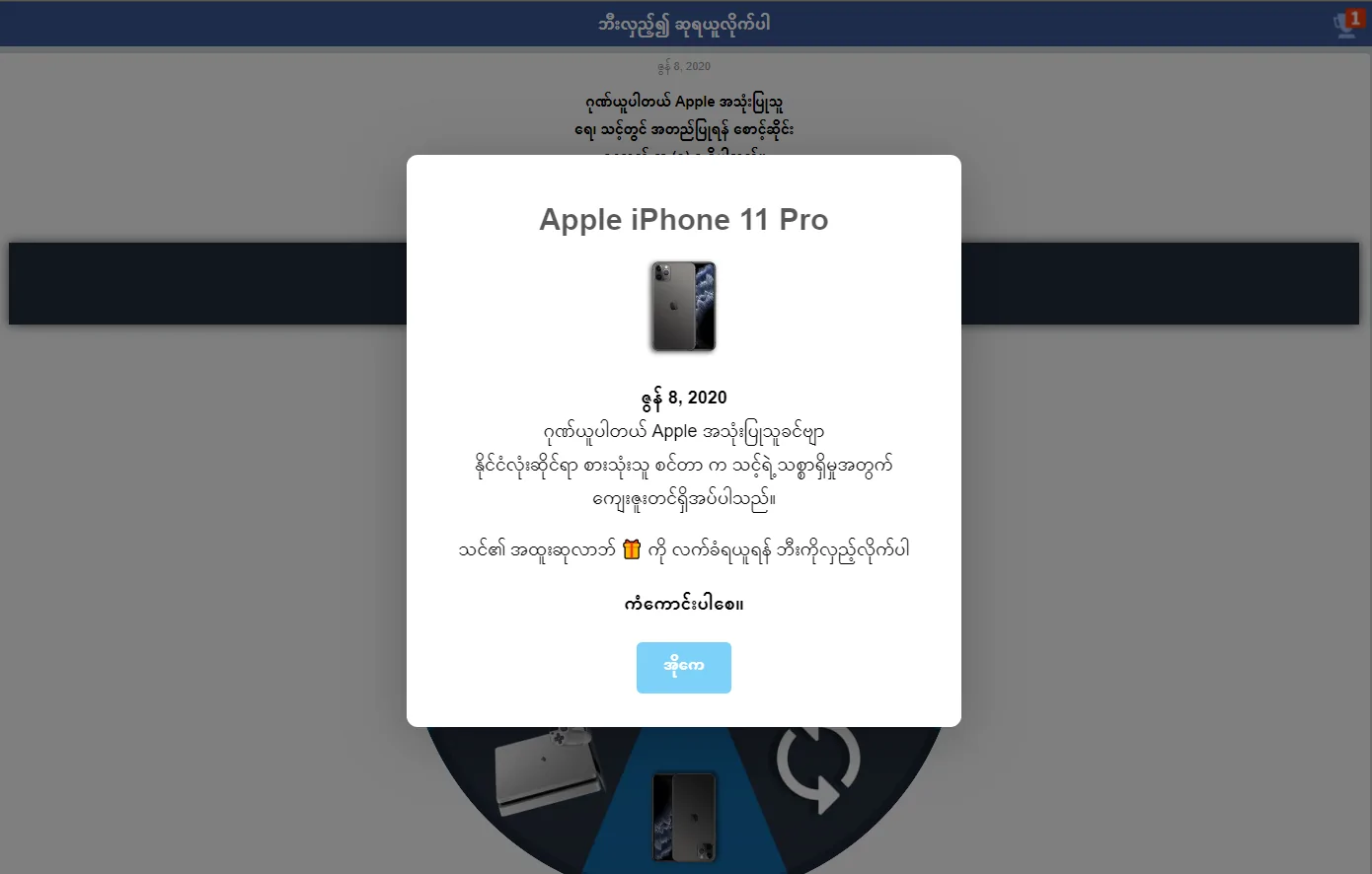
For the template test, I wanted to get the quickest results possible. That’s why I picked a single opt-in (SOI) Sweepstake offer with an Apple iPhone 11 Pro as the prize. The conversion flow was also the easiest – SOI when a user registers with an email, you get a conversion, no additional confirmation needed.
The advertiser’s landing page:
Pre-lander:
Ad creatives and template settings
For the Classic and Blur Dark templates I chose the same image of a gift box and a simple text: “You’ve got a chance to win unclaimed prize! Look what’s in the GiftBox”.
Classic
I started with the “Classic” template, which contains a simple image banner and 1 line of description.
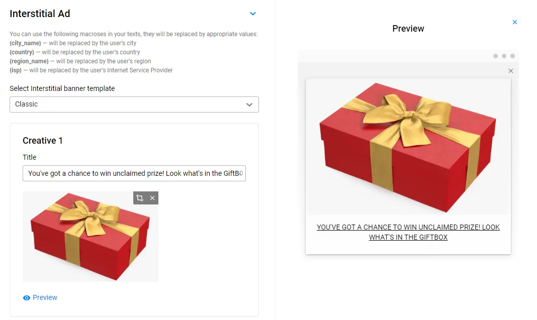
Customizable: banner, description
Pre-defined: text format, text placement
Dark Blur
Dark Blur has 2 text fields – title and description, so I split the text and put the part about the prize in the title to make it more visible. The new “Dark Blur” has some nice CTR-boosting elements:
- big title and separate description
- floating green button, but the text on it is pre-defined and you can’t change it.
Customizable: banner, title, description
Pre-defined: button text, color, placement
Prize
I created another campaign and selected my last examinee – the “Prize” template. Its unique features are:
- cool animation of falling prizes (or anything you upload)!
- partly pre-defined description
- very native looks, close to mobile operating systems messages
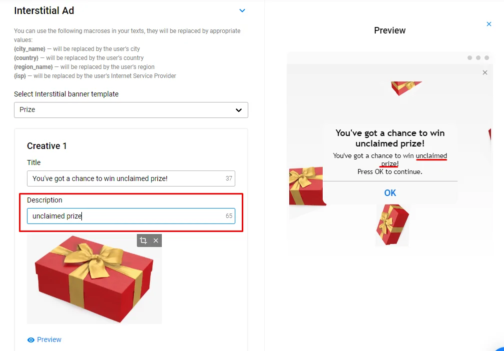
Though, setting it up turned out a bit more complicated. First, I entered my main message into the “Title” field and checked the preview. My text was displayed in full. But when I started typing the description, I noticed that the preview already had some default text.
The thing is, in the description of the “Prize” template you should enter only the name of your gift, not the whole sentence. Seems not very effective? Let the test show, I thought!
Later on, when I was setting the targeting, I had to double-check with PropellerAds support if the predefined text is automatically translated into the users’ browser language.
Customizable: banner, title, part of the description
Pre-defined: part of the description text (You’ve got a chance to win)
TIP from the Support Team:
The default text is automatically translated into the language of your user’s browser.
The translations available for Arabic, Chinese Mandarin Simplified, English, French, German, Italian, Portuguese (Portugal), Russian, Spanish, Thai.
Campaigns setup and results
For the geo-targeting, I chose Myanmar (MM). The traffic is relatively cheap and it meets the requirements of the offer. The settings I applied to all of my campaigns:
| Geo: Myanmar (MM) Bidding model: CPC OS: Android OS Type: Mobile |
Results
My main goal was to make a RON test of the templates’ performance, so I decided to spend $50 on each creative and get a proper amount of traffic as soon as possible. After less than 2 days without any optimization I got my absolute winner:

As you can see, the top CTR was in the campaign with the “Prize” template – 29.77% (wow!) and 194 conversions.
The CTR of the“Prize” is so high that I can easily lower the bids in the “Prize” campaign by 3 times and due to a lot of clicks, still get big volumes of traffic.
Exactly as I expected, animation catches user attention and the native looks of the message box motivate them to click. The only problem I see is that you can’t use the template with any other vertical rather than sweepstakes. But sweepstakes still work great, don’t they?
The second place goes to the “Blur Dark” creative with around 16% CTR and 82 conversions. Here I believe the button does the trick, though the ad doesn’t look so native, as with the Prize. On the other hand, it can be used for any offer, not only sweeps.
The campaign with the old creatives got the lowest CTR and CR, but still brought 74 conversions, which gave me a nice whitelist of converting zones.
We have MORE case studies. Check them out!
The next step obviously is to collect the whitelist from all 3 campaigns and start a separate campaign unleashing the power of the “Prize” template, but this looks like a whole new case study which I can get paid for 🙂
People want to read your comments so share your thoughts or join our BIG Telegram chat!
