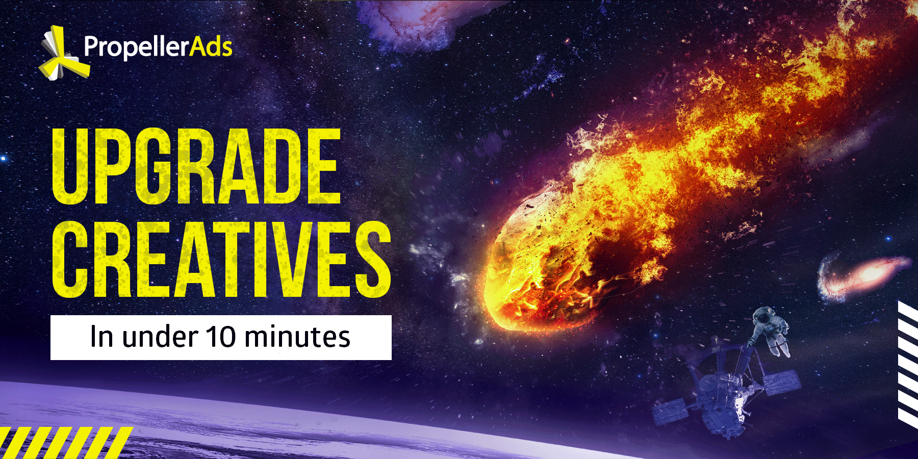
How to Upgrade Your Creatives in Under 10 Minutes?
This post is also available in:
![]() PT
PT ![]() ES
ES
People are visual creatures from the days they adopted upright posture. We make so many decisions depending on the very first, namely – visual, impression we receive. And these are not just abstract thoughts – the same happens with users that see your ads.
How to make your creatives capture people’s attention? And even more important – how to evoke users’ desire to act immediately?
Well, today we are going to discuss the art of making your creatives shine in 10 minutes. Continue reading and you will find the answers to these questions, examples, expert advice, and an exclusive offer from Propeller.
Step #1: Choosing the color
It’s no secret that colors evoke associations and therefore – emotions. They can help you deliver the right message to your audience. From our experience, the most widely-used basic colors for affiliate marketing ads are red, green, and blue. And they relate to different emotional messages. Let’s discuss each of them:
Red
Red color can express danger or urgency, which makes it perfect for VPN or antivirus offers. Say, you may use the red color to inform your visitors that software or extension can help them stay secure online. Like this:
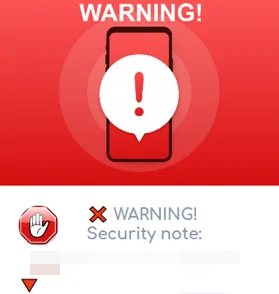
Such a banner has all the potential to catch the attention of your visitors – it’s really hard to overlook something as stand-out as that.
Green
The very first association with the green color is nature and well-being, so it is perfect for all offers related to eco-products, diets, healthy nutrition, etc. Here is a classic example:
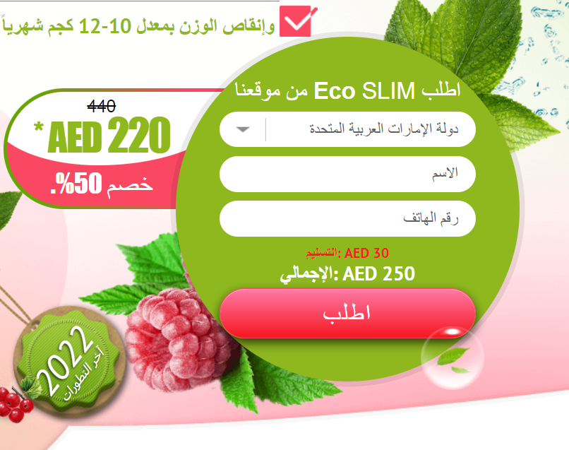
So fresh and sweet! Impossible to resist filling that adorable form, right?
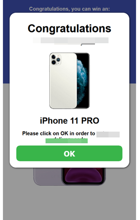
What is more, green is associated with activity and encouragement. You can also use it to motivate your visitors and make them act, like this cool green button:
Blue
Blue, as the color of water and sky, stands for calmness and stability. Using it for your creatives can help you evoke the feeling of reliability and safety in your users. Why don’t you try it for Utilities or Software? Like this:
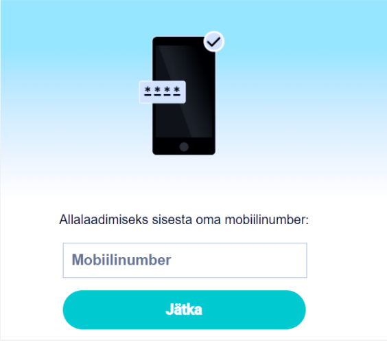
Whenever the ad is mild and soft, it looks more trustworthy and professional.
Colors that evoke opposite associations can be used for different types of offers. Depending on the aim you have – whether to evoke a sense of urgency or rather thoughtfulness and reliability – you may choose the one that suits your creatives better.
As these were the basic colors, let’s also list additional ones, which can work really efficiently in a combination with those we have already mentioned:
- Yellow – cheerfulness and joy, associated with sunlight – works cool with green;
- Purple – mysterious and creative, associated with thought-provoking and interest – can be combined with yellow and white;
- Black – official and calm, associated with power – perfect when combined with yellow;
- Gray – neutral and reserved, also official and reliable – try using this color with blue;
- White – purity and sincerity, associated with innovations and trustworthiness – fits green, red, and dark-blue.
You can change the colors of the existing creatives with simple online photo editors and see which one suits your advertising message better.
However, whenever you choose colors for your creatives, don’t forget to check if they are acceptable for your audience in terms of the cultural background. For example, in India, white color is associated with mourning, since people wear white clothes to funerals, while Africans associate red color with death. Do your small GEO research before choosing the color palette for your creatives to avoid dubious and negative user reaction.
Step #2: Adding attention-grabbers
So, after you have chosen the most appropriate colors for your creatives, let’s see how we can make them even more attention-grabbing. Let’s start with some advice from a member of our designers team, Marina Rubieva:
“The Internet is literally flooded with ads today. This means that your banners have to be inventive if you want people to notice and click them. Make sure that each element of your banner – colors, photos, signs, or symbols – works in a tandem with all the rest. They should support the same message, emotion, and style. Make your images consistent, but don’t be shy to go a bit crazy – unusual decisions can be catchy!”
So, whenever you add a contrasting element to the image, maximally appropriate and bright, it automatically engages users. We, people, are very sensitive to signs and symbols.
Let’s compare:
See? Even when we add the simplest imaginable arrow that represents “before/after”, our creative becomes much more clickable.
When a user scrolls the page, he is more likely to notice the image with an arrow, since he is wondering what exactly you are trying to show. The same happens with frames:


And circles:

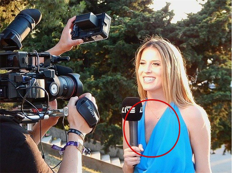
The example with a circle is pretty schematic – we used it just to show the principle and difference. However, we bet that you have been looking at the marked area for a while trying to figure out what is so special about it. Gotcha.
And the similar thing happens when you use numbers:


See? All of these super-simple graphic elements can be added to your creatives in a minute – they don’t require any design skills. Still, the effect is stunning – minor contrasting elements will definitely stop a scrolling user for a while and increase your chances of getting a conversion. Try it!

Step #3: Don’t forget about testing
Guess, you already know that choosing the best creatives for your campaign is a matter of tests and analysis. No worries – simple A/B testing is enough here. How to do that? Easy:
- One creative or set of creatives at a time
To understand how exactly your creatives affect the audience and whether they are converting or not, make sure to test them separately. If you do so, you will have comprehensive data for your analysis and will easily distinguish the best option.
- Make them different enough
Try comparing various basic images, changing color pallets, and contrasting elements. To receive objective results, you should make your materials as different as you can.
- Text also matters
Even though we mostly talk about pictures today, it is important to remind you about the text part of your creatives. While a stunning picture is the first hook, the copy you write ensures that users won’t skip your ad later on.
That’s how it works: you engage their eyes with an appealing pic and then their attention naturally slips to the text. If it still keeps or even strengthens their interest, your chances for clicks and conversions grow.
After you make several tests, choose the best combination and reap off the cash! Good luck with your campaigns!
By the way…
Hey, we have a very special offer for all readers of our blog. The PropellerAds designers team has already created a gazillion of impressive banners, so they know all the tricks. Would you like them to check and rate your creatives? You’ve got that!
Send your banners to us and get feedback from the best professionals in the industry! Grow with us!
Have more ideas on how to jazz up creatives? Then let’s discuss them in our affiliate marketing Telegram Chat!
Trends
View more posts