Psychology for Affiliates: Can Colors Affect Conversions?
This post is also available in:
![]() PT
PT ![]() ES
ES
Do you know why fast food chains usually use red and yellow in their restaurants? Or why luxury product manufacturers often use deep purple and gold in their branding?
The answer is simple: it’s because of color psychology.
Even if we don’t notice it, the colors we see directly impact the way we feel. Depending on the color and its intensity, some hues trigger strong physiological responses that are beyond our control, so affiliates that understand how the different tones affect consumers will be able to produce better ads.
Below, we’ll go over the theory of color psychology and how affiliates can use this concept to improve the conversion rates of their ads.

The Theory Behind Color Psychology
Although there is still a lot of research that needs to be conducted, experts have identified a connection between colors and our emotions.
According to the theory of color psychology, different hues produce different emotional and physiological reactions in people. Not only this, but people also associate certain colors to distinct items or events, which can trigger a specific action or change users’ perception.
What Affiliates Should Keep in Mind for their CTAs
The CTAs on your ads tell users what actions you want them to take, but you have to do much more than choose the right wording. In addition to the text, size, and shape of your CTA buttons, you also have to consider the colors you’ll use.
Some of the things you want to keep in mind include:
Colors Psychology
It’s important to understand what reaction each color produces in order to use the right combination in your ad.
- Red: Represents passion and importance, known to raise blood pressure
- Orange: Optimism, fun, and confidence
- Yellow: Happiness and attraction, works well with black
- Green: Success, nature, and health
- Blue: Trustworthiness, relaxation, and safety
- Purple: Creativity, luxury, purity
- Black: Elegance and power
- White: Virtue, cleanliness, and innovation
- Grey: Professionalism and neutrality
It’s important to note that the tone of the color also affects the intensity of the reaction caused. The lighter the tone, the softer the effect, while darker colors produce a more intense reaction.

Cultural Distinctions
Before developing the best CTA, you have to know as much as you can about your audience, including their cultural interpretation of colors. For instance, the color of death in China is white, while Brazilians use purple as their mourning color. Knowing these differences will help you develop better CTAs and ads in general, so focus on color to produce the best landing pages.
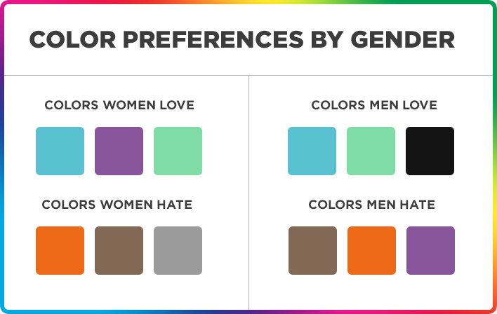
Gender Differences
Keep in mind that men and women have different reactions to the same colors. These are partially influenced by environmental and cultural factors, but women tend to prefer primary colors with highlights while men prefer green and black.
Seasonal Color Palettes
Seasonality should also affect the colors you choose for your ads. You don’t necessarily have to take this into account, but having the right colors on your ads will help attract consumers who are looking for seasonal items and improve their customer experience.
How to Implement the Appropriate Color Strategy
Knowing how colors affect consumer behavior is the first step. Now. It’s time to implement this knowledge and make adjustments to your strategy.
To identify the color scheme with the best conversion rate, focus on:
A/B Testing
You’ll want to set up split tests with multiple CTA color variations and carefully monitor how your audiences react to each one. As your campaign progresses, you’ll be able to identify positive patterns and narrow down the best variants.
Contrasting Colors
Contrasting and complementing colors improve user experience, plus they can also help you highlight essential information about the product or service being promoted. For CTA buttons, you want to use contrasting colors that increase reliability, while complementing hues are better suited for logos and other branding elements.
Colors and Affiliate Verticals
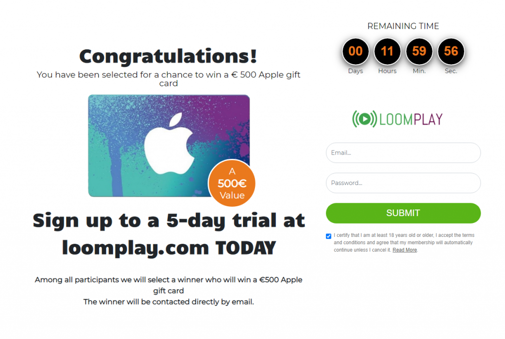
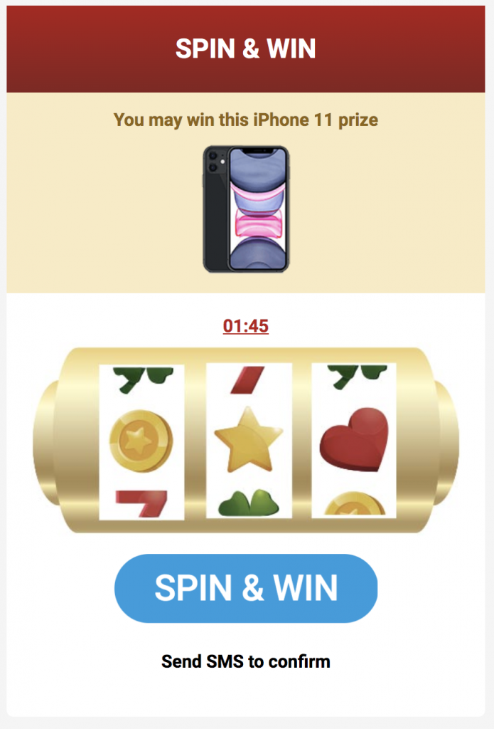
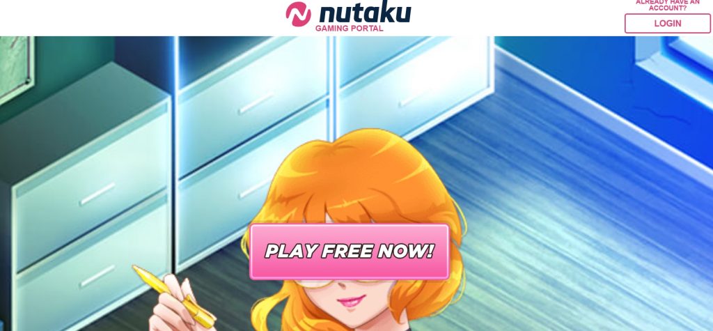
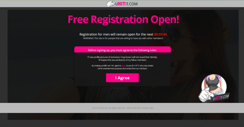
Landing page and pre-lander examples from Zeydoo
For affiliates, it may be easy to think about colors according to the verticals they’re suitable for.
- Dating: Red, pink, and black
- Sweepstakes: White, black, green, orange, and red
- Finance: Green, blue, black
- iGambling (Gambling + Betting): Yellow, brown, and green
- Streaming: Red, black, and orange
- Gaming: Blue, green, and pink
- Nutra: green, Green, red, blue, and brown
Want to pick up more tips to improve your conversion rates? Follow our blog or check out our busy & fun Telegram chat!
Trends
View more posts