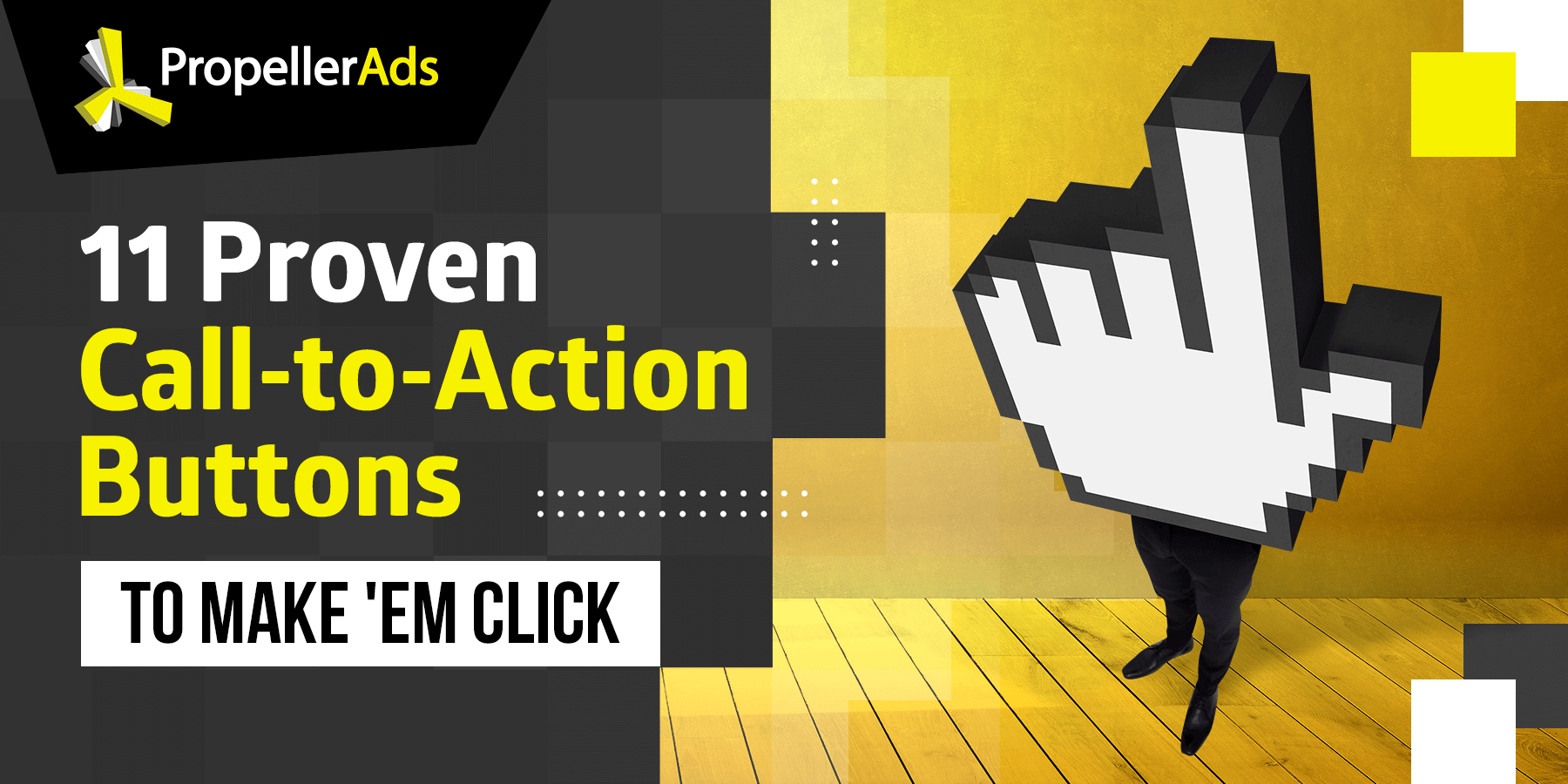
11 Proven CTAs for Affiliates
When most people make a decision – whether it’s to wear, eat, or buy something – they believe it came simply from the fact that they wanted to perform this action.
In reality, there are dozens of different elements that impact a person’s decision-making process. Heck, depending on the situation, there may be hundreds of elements you have to keep in mind, so knowing which one has the most power can help you influence your targets’ choice.
A call-to-action or CTA is one of the many elements that impact your audience’s decisions. But, unlike other factors that you have little control over, you can design and create your CTAs according to your specific goal. Which, in the case of affiliates, means higher conversions.
In this article, we’ll go over 11 proven CTA designs that may bolster the performance of your campaign.

How Should You Build Your CTA?
For starters, let’s go back to basics discuss the different elements you have to consider when creating your CTA.
Ad Copy
Before even thinking about the CTA, you should develop and access the ad copy. Text elements should be relatively brief, yet entice your audience to interact with your ads. This means that your ad copy should:
- Be action-oriented
- Use the first-person
- Create a sense of urgency
- Eliminate objections or friction
Once you have developed the copy you’ll include in the ad, you can start looking at the CTA.
AB Testing
Remember, all affiliates and industries are different. What certainly works for some marketers may produce awful results for others, so always run AB testing after developing a new CTA. And, once you collect enough data, remember to optimize and make changes accordingly.
11 Proven CTAs that Work for Affiliates
Now that we’ve discussed the CTA-building process, let’s look at 11 proven examples that can catapult your campaign to success.
Subscribe
Simple. Sweet. Elegant. Calls-to-action that are easy to understand, tend to have a profound effect and “subscribe” is the perfect example. It doesn’t invite people to pay, it works because it entices you to subscribe and enjoy the benefits of the products being promoted.
That said, you’ll want to support this with a brief and information ad copy, so users know what they are subscribing to.

Try for Free
It’s very uncommon to find a website or digital platform that doesn’t offer a free trial. This is because consumers absolutely LOVE free stuff and won’t hesitate to fork out the money if they think the product or platform is worth it.
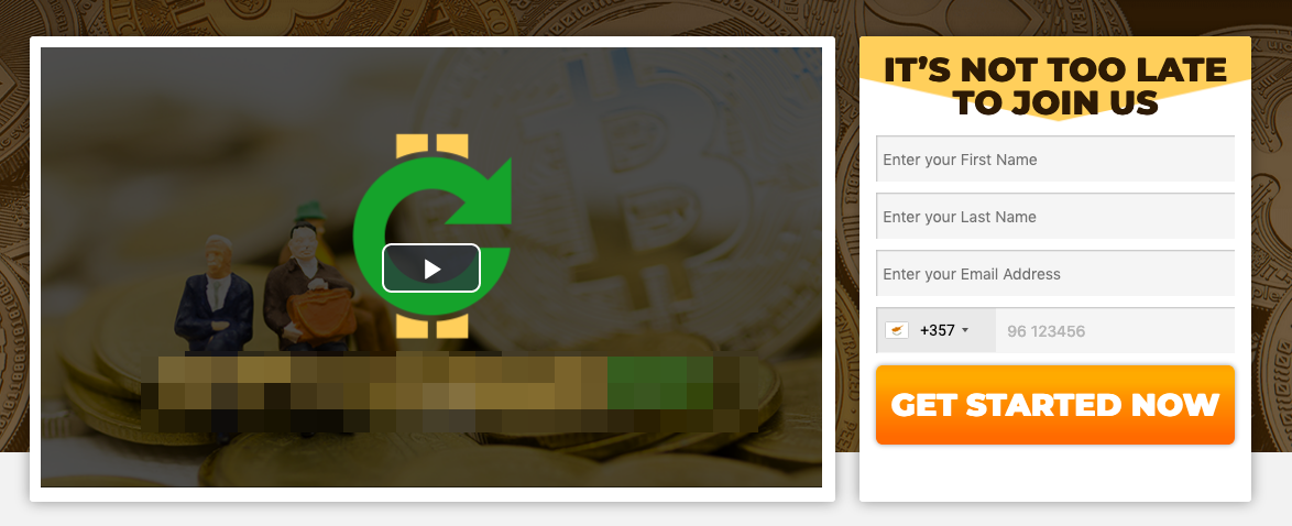
Get Started
This CTA is ideal for conversions that don’t necessarily require money. It’s super-friendly, so it produces great effects when offering a free trial, discount, or other benefits.
Yes, I Want X
Showing empathy can go a long way, which is the reason why this call-to-action works so well. By putting yourself in your audience’s shoes, you can create an ad copy that talks their language and support it with a solid “Yes, I Want X” to reel in more conversions.


Snag/Grab/Seize/Score/Gain X Now!
While this CTA can vary a lot, the goal remains the same. You need to create a sense of urgency and use words other than “get” as this is the most boring option. However, using the words snag, grab, seize, score, gain, or enjoy can be a powerful driver.
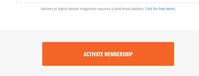
Activate X Today!
If you are offering free demos, discounts, or shipping promotions, you can always implement the “Activate X Today!” CTA. Why does it work so well? The sense of urgency combined with a powerful action word like “activate” can change consumer mindsets and push them towards the conversion.
Don’t Miss Out!
Fear of missing out is one of the biggest motivators for consumers. You can play on this feeling by creating a time-sensitive promotion, say for a discount or freebie, and use this CTA to push through as many conversions as possible.
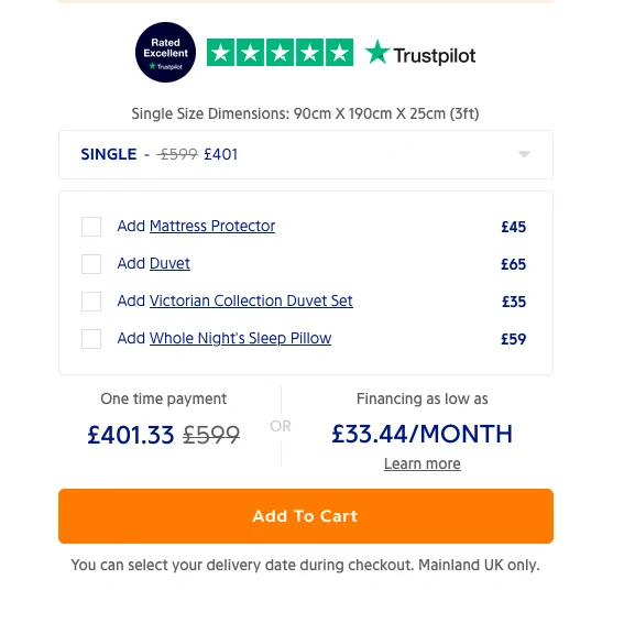
Add to Cart/Add to Wishlist
There’s a good chance you’ve made an online purchase on Amazon or another big eCommerce site. You’ll notice that there are always two CTAs that work as anchors for these sites, which are “Add to Cart” and “Add to Wishlist,” which push for two differently but equally important steps.
Why do these work? Consumers who aren’t ready to buy all of the items in their cart can create a wishlist, which you can take advantage of through a remarketing campaign.
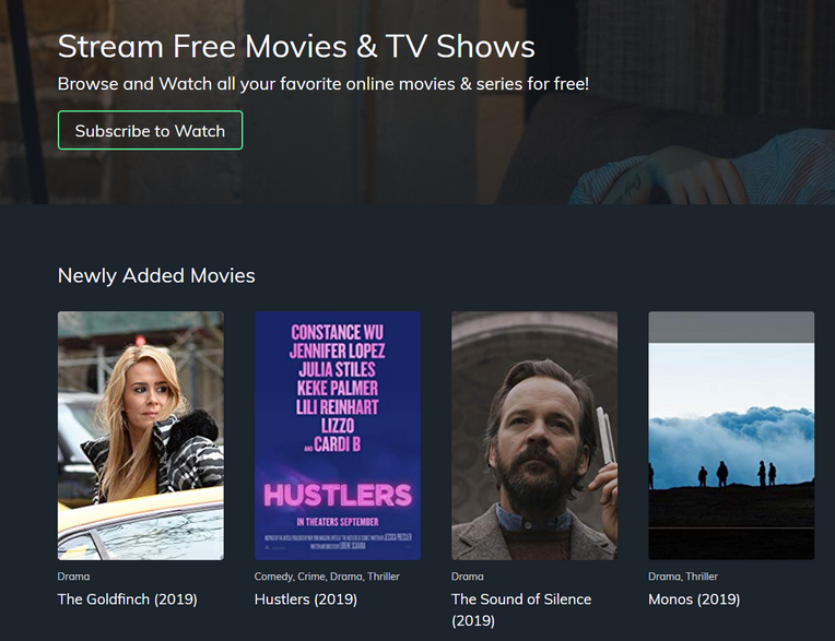
Watch Now/Instantly
For affiliates and other marketers in the entertainment and streaming spaces, this CTA is a gold mine. Don’t believe us? Simply as AppleTV and other successful online services that have created entire landing pages with this prominent CTA being featured at the center.
Get My X (for Free)
This CTA is extremely versatile and it can be used with a huge array of promotions. It tells visitors to simply take advantage and get whatever it is you’re marketing. You can use this CTA for paid subscriptions and products after a detailed ad copy. On free offers, you can also add the words for free (like in the parenthesis on the heading) and let users know that there are no strings attached.

Click to Save
Generally speaking, CTAs that push towards a purchase may be off-putting. However, you can change this negative emotion by leading with the fact that users would be saving money through your ads. That said, we suggest using these stronger CTAs in combination with cool colors, like green and blue, in order to keep visitors relaxed.
Learn More About Building an Awesome CTA
CTAs have the ability to transform your campaign if implemented correctly of course. The tips above should help you implement different calls-to-action until you find the combination that takes your ads to the next level.
Trends
View more posts