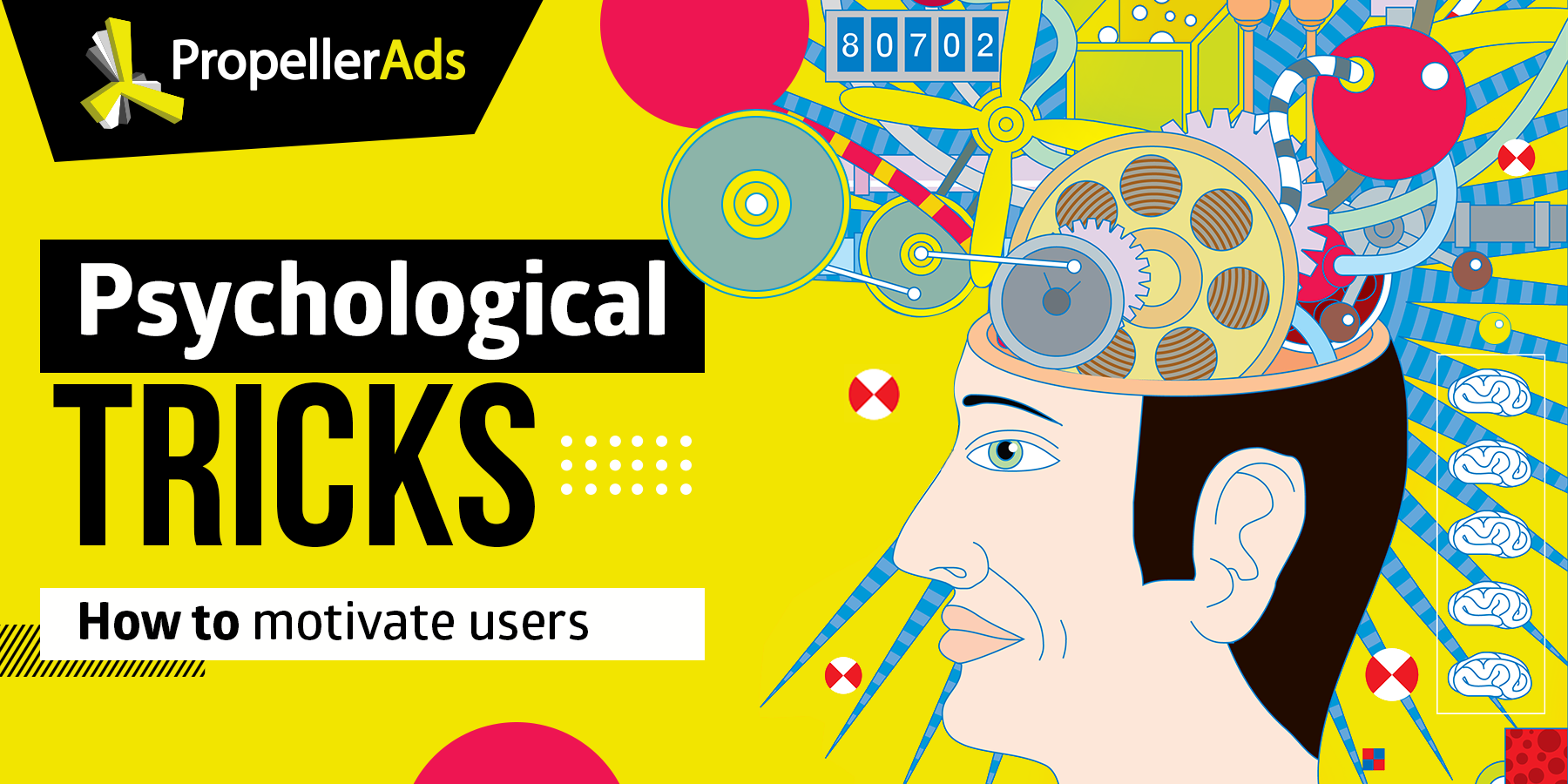
9 Psychological Tricks to Increase Conversions and Make People Buy Your Popcorn
This post is also available in:
![]() PT
PT
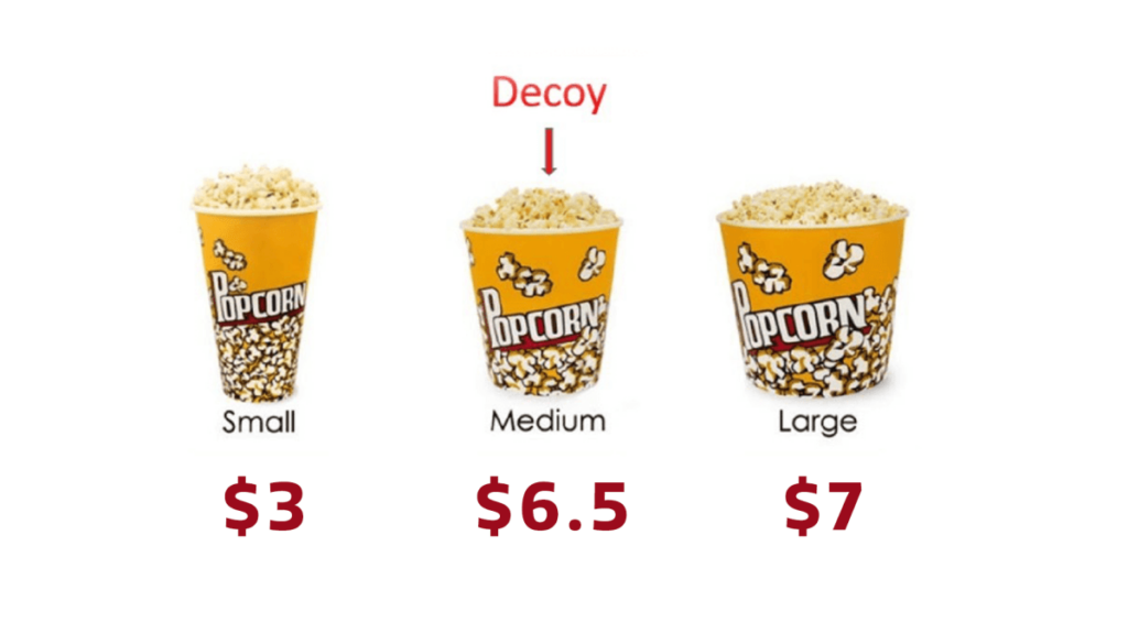
Don’t know about you, but I am the kind of person who always buys popcorn at the movies. Yes, that ridiculously expensive paper bucket of overly salted corn, which is worth maybe 50 cents. And each time, I spend 10 minutes at the bar struggling to choose the bucket of the right size.
Seriously, it’s impossible.
Small seems like it’s not enough; the middle is okay but kinda pricey for its size; the big one is a nice deal, but I definitely don’t need that much. Or maybe I do… Long story short, I always end up buying the large one, even though I never finish it.
And every time, I ask myself: why do I keep doing something so stupid?
That, my friends, is all because of the dirty psychological tricks that marketers pull off on us in order to sell us their stuff. This particular trick is called the decoy effect, and it makes people instinctively pick an option if it looks significantly better than the other one.
Those tricks are very popular and you can find them in pretty much any marketing campaign. So, first, let’s find out why they are so effective.
Why do people fall for this stuff?
Okay, time for a big revelation. All those psychological tricks work because of the cognitive biases that all humans have.
A cognitive bias — is a systematic error in one’s thinking process that forces people to make irrational decisions. Here’s a pretty boring explanation from Wikipedia that uses lots of really long words, but I guess you get the idea.
That’s just how our brains work — they are “lazy” and constantly look for ways to spend less energy on decision-making. Biases provide our brains with a short-cut, offering a decision that doesn’t require too much horse-power to come up with.
Speaking of powers, that of cognitive bias is so strong, that even knowing of its existence, we simply can’t resist falling for it. That’s why they are so widely used in marketing and online advertising, and that’s why you should use them, too.
In this post, I want to show you how you can exploit cognitive biases in your campaigns, improve your CTRs and conversions and eventually make people buy YOUR popcorn.
The most common cognitive biases and how to use them in your campaigns
These methods are actually common knowledge, so I’m confident that you’ve seen them in practice. Moreover, I’m certain that you used some of them in your campaigns, maybe without even knowing it. So, it probably won’t blow your head off with novelty, but it’s always nice to have a few extra tricks up your sleeve.
The decoy effect
When people make purchasing decisions, the key factor is usually the price. You pick the option based on how much it costs, other things being equal. However, there’s a certain pricing strategy that makes you switch to a more expensive option — it’s called the decoy effect.
Let’s bring up my popcorn example. If there were only two options in front of me, small and large, I’d probably go for small, because it’s cheap and that’s just as much as I need. But the sly marketers added the third option, the mid-sized bucket, and this is what broke my thinking process.
The mid-sized bucket costs almost as much as the large one but contains disproportionately less popcorn. That makes the large bucket look superior as an option. And not only compared to the mid-sized bucket, but also to my initial choice, the small bucket. This is what the decoy effect is about: by adding an option that looks significantly worse than the other, we make this other one look more appealing to the consumer than all other alternatives.
This effect was well described in Dan Ariely’s book Predictably Irrational, but if you’re not that into books, you can watch his insightful TED talk about it. Highly recommend!
How to use it: The decoy effect can be used on pricing pages, landing pages, when upselling and anywhere you want to convince the user to go with a more expensive option. Decide on which option you want to push forward and add a decoy to highlight its value.
Analysis paralysis
The choice is good, but having too much of it can be paralyzing. In today’s world of abundance, people are facing an overwhelming amount of choices every day. Your job is not to make their life harder.
The effect called analysis paralysis, or analytical paralysis, takes place when the user has too many options to choose from and none of them dominates the others, as it was in the previous example. In this situation, it becomes too complicated for a user to make up their mind, which often results in them refraining from making any choice whatsoever and leaving.
This issue was well demonstrated by the classic Jam Experiment. A grocery store in California built a display to sell jam. At times when there were 24 flavors at the stall, the conversion was at a mere 4% level. And when there were only 6 flavours, it got to as high as 31%.
How to use it: this effect should be taken into account every time you provide people with a list of options. Pricing plans, landing pages, CTAs — they all work better when the user doesn’t have any trouble focusing. The ideal number of options is 5+/-2 and anything above that will be significantly harder to manage. So, here’s my pro tip: avoid cluttering your pricing pages or landing pages with too many options. Sometimes, the liberty of choice is just too much to handle.
Next, we’ll have a bit of a far-fetched example, but here’s how Apple prevents analysis paralysis when selling iPhones. They never display all the models on one page not to overwhelm the shoppers. Instead, they give them the ability to compare up to 3 options by price and other characteristics.
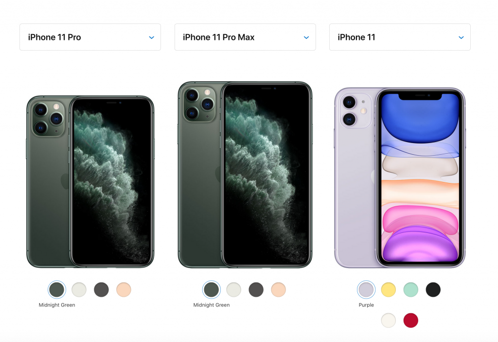
Technically, all the information necessary for comparison is out there. The user just doesn’t see it all at once and doesn’t get dazzled by the abundance of choices. So be smart. Be like Apple. Take people’s choice away (just kidding – don’t).
Anchoring
One of the things that make humans’ brains special is our ability to make comparisons, like, really fast. Its inevitable consequence is the anchoring bias. When learning something new, we place an “anchor” to the first piece of information that we find about the topic and base all our future decisions on this anchor, regardless of what information comes afterwards.
For example, if I tell you that the prices for Kytombrian wine start from $250 a bottle, and then tell you about a shop that has a few cases on sale for only $150 a bottle, you might consider it a good deal. Even though that’s just something I made up, including the wine itself — what kind of a name is it anyway? — your brain automatically compares the “discounted” price to the original one, because the original price is the first thing you’ve learned.

And here’s an example from the affiliate world. Affiliates often uptake traditional marketing methods and bring them somewhat to an extreme. That’s because people’s attention barrier is usually much higher for affiliate ads, than for traditional marketing channels. So, the triggers should be much stronger: flashier ads, pushier offers, you know. Whatever makes them convert.
What does it mean anyway? Create a context. When writing your native ad copy, or creating content for landing pages, always provide the user with context about the offer and give them enough “anchors” to base their decisions on.
Availability heuristic
This bias demands us to go with the easiest choice. In other words, our brain thinks that the best solution is the obvious solution, or the first one that pops into our mind. To take advantage of it, you need to give people obvious solutions. Or rather, make the solution that you want them to pick seem obvious. Classic brainwashing.

Here, you can see which option the seller wants people to take. It’s marked with the “Most popular” tag, it’s pre-selected, it has a frame and a discount bubble — clearly, that’s what one should pick.
How to use it: highlight the option that you want users to go with by all means possible. Use frames, special tags, discounts, golden ribbons, and confetti — make this choice as simple as possible.
Knowing of this bias can also help you make your creatives more appealing. When given two options, one of which is a no-no, the user is triggered to pick the other one, even if initially they were not planning to make a choice at all. This behavior is conditioned partially by the decoy effect as well, yet the availability heuristic is another factor that enables it.

See, nobody wants to be out for glory at full cost if there’s a chance to buy the same stuff at a discounted price. So, that’s what users do: pick the green button just to avoid clicking the grey one.
Where to use: creatives, landing pages, pricing pages, pre-landers. Make their choices seem obvious.
So, you’ve noticed that all the above-mentioned biases apply to prices, one way or another, or rather, the way people perceive prices. That’s because the price is the key factor for many decisions, so I thought, it makes sense to talk about it first. But there’s another very strong component to any purchasing decision, and it derives from the fact that we are all social creatures.
The desire to belong, to feel a part of the group is as strong as the desire to save one’s money, maybe even stronger. So here we go, the next big group of biases is about the way we deal with other people and how we perceive ourselves in the social context. And of course, it’s about how you can benefit from it as an advertiser.
Read also: Nutra Pre-Landers: Sure-Fire Ways to Convert
The herd instinct
As I said, people are social animals, even if you’re not happy with the analogy. The 21st century changed it, but before humans could only survive in groups. Having a community to contribute to and take care of you guaranteed survival, that’s why the necessity for connection with other people is hard-wired into our brains.
There are many cognitive biases that arise from it, and first of all, it’s the herd instinct. People have an instinctive desire to follow the lead of the majority, because it sends a signal to our brain that such behavior is right because it’s safe.
How to use it: the ways of exploiting this feeling are innumerous, but you can start by capitalizing on any kind of hype. Create connotations with trending events, run seasonal campaigns, mention anything that everybody else is doing. A good example would be everything that happens on Black Friday or during the World Cup series. Betting and e-commerce are the two verticals that benefit hugely from it, but it works just as well for others.
By the way, we’re no strangers to this tactic, too.
The bandwagon effect
Alright, so you’ve jumped on the hype train, how do you make other people join you and pump up your conversions? That’s what the bandwagon effect is for.
The bandwagon effect is similar to the herd instinct, but it a way that it makes us believe in things if others express belief in it, too.
For example, reviews or customer stories work as social proof and serve to convince more people to try the product. And it doesn’t have to be a top-notch layout page. There are many examples in affiliate marketing when the review section imitates social media comments.
How to use it: to make people trust in the product you’re promoting, show them other customers that have already used it. You can embrace the bandwagon effect by placing reviews, customer success stories, app ratings, and so on. Your landing pages are your blank canvas.
The likeability effect
There’s one big “but” to the bandwagon effect. It only works if the people talking about their experience with your product are likable by your target audience.
The paradox of likeability is that people have a special connection to everything and everyone that reminds them of themselves. So, if you use storytelling, make your characters relatable, let your target viewers recognize themselves in those characters. By analogy, they’ll find your product more likable.
Because of the likeability bias, such banners work like magnets. Even if the viewer consciously thinks that it simply can’t be true, the ad is stupid, and banal, and so on, subconsciously they are still hooked. And that’s what matters.
There is another bias closely related to this one: the in-group bias. It makes people subconsciously prefer members of their own group, however virtual it is, over people who don’t belong to it. For example, a person will subconsciously trust another person if he/she is a fan of the same sports team or went to the same school.
How to make everyone happy: there’s no escaping it — to succeed, you need to research your target audience. You can even go as far as creating personas for your ad campaigns. If you decide to use social proof on your landing pages or in ads, make your characters recognizable and likable to your viewers. If they can relate to your existing customers (and let’s be honest, those reviews don’t necessarily need to be real), they are more likely to transfer their affection to whatever it is that you’re advertising.
Unit bias
That’s one of my favorite biases — if there can be such a thing as a “favorite bias”, but anyway — because I have a few mild OCDs, so I can completely relate. According to it, people are programmed to complete all the stages of a given task, or a task unit, simply because not finishing makes them feel “itchy” in their brain. It mainly relates to activities such as eating but also shows in other areas of life.
Imagine eating a piece of cake. It’s creamy and spongy, and it’s your favorite flavor, and you have only one spoon left, when suddenly you hear a phone call. The natural reaction is to quickly eat the last spoon and answer it. Now imagine not doing it. Chances are this unfinished spoon will haunt you for the rest of the phone call. That’s because the task unit wasn’t completed.
What does it have to do with advertising? Funny as it sounds, this cake thing can be applied to affiliate marketing. When the user performs a certain action, such as filling out a registration form, they invest their time and effort in it. Leaving the page with an unfilled form would make them uncomfortable on a subconscious level, so they are motivated to finish it.
You have two jobs here:
- First, don’t create extra obstacles. Mind the analysis paralysis and don’t create long registration forms with dozens of fields if, for example, your traffic is mainly mobile. Make it short and sweet.
- Provide your registrants with context: show them how many steps are left to complete, motivate them to have some kind of a “closure” with it. For example, phrases “You’re almost there!” or “Just one more step to go!” can keep a user on the page.
Here’s an example.
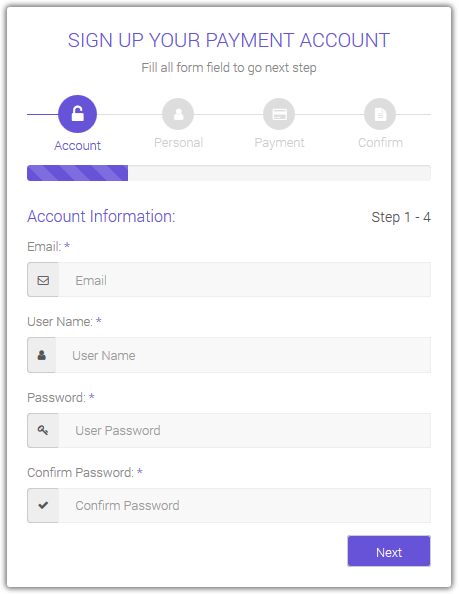
Image source
Here, the registration form is divided into steps, so even if you don’t show all of them at once on one screen, the user can see the bar at the top of the page which indicates how many steps are left.
FOMO, Scarcity and Urgency bias
And here we go with one of the most beloved tricks that marketers all around the world use as often as they brush their teeth. Maybe even more often.
The sense of scarcity makes people rush into purchasing decisions past all rationality. And FOMO, the fear of missing out, heats things up creating a true conversion Eldorado.
The instinct to make provisions lies deep in the old areas of our brain, that helped humans survive during long cold winters. Once you manage to “pinch” it, the shopper turns from a middle-class family guy into a caveman scraping for wildberries and roots.

How to use it in your campaigns? I’d be surprised if you haven’t used at least some of those tricks already because they are just so common.
- Countdowns
- Limited stock
- Limited time offer
- Limited-time sale
With these kinds of triggers, the urge to buy — or convert in any other way — is so strong that even I, writing this, feel like I need to go buy presents for some distant relatives or finally get myself a robot vacuum cleaner.
That’s all folks
Always remember: you advertise for the most irrational creatures in the whole world — humans. And as such, they are prone to all kinds of cognitive errors. You are not an exception, too, but that’s not the point. Your job is to know who you advertise to and find out how they think — mainly, by testing. So, test everything: your creatives, your landing pages, various offers, the conversion process, etc. And once you find a working combination, go for it — I’ll leave you on this highly motivational note.
Hey, and if you liked the post, type something down below — writers feed on comments <3
Trends
View more posts