What’s Wrong with Your eCommerce Landing Page?
This post is also available in:
PT
ES
Since the inception of online purchases, eCommerce platforms have been trying to convert visitors into paying customers. The idea is simple – get the people that make it to your landing page to buy the goods you’re offering.
But, that’s easier said than done, I’m I right?
There are hundreds of factors that influence consumers and their decision-making process. And sometimes, it’s not that a landing page is missing something, but more like there is a certain element that’s gumming up the rest of the works.

For this reason, we’ve put together a post that highlights the things you should avoid at all costs in your eCommerce landing pages. Also, we’ve invited over our Head of Advertisers, Matvey Shmidt to share some tips on eCommerce.
Without further ado, let’s jump in!
Landing Pages and Ads Aren’t Aligned
If you employ push notifications in your sales funnel, you need to ensure that the message on the landing pages aligns with the ads you’re showing. Mismatching information will discourage visitors and kill your LP’s credibility.
Instead, make sure that your CTA has the same offer that appears on the title as well as on the link that visitors use to get on your page.
For example,
If the title or link says: Complete our survey and win an amazing smartwatch!
You want your CTA to say: Claim your free smartwatch today!
There’s More Than One Offer
When talking about eCommerce platforms, the sole purpose of a landing page is to generate a sale. However, if there is more than one offer, there’s a chance your visitors will get distracted, start navigating other products, and put off the purchase until later.
You can avoid this by ensuring that your landing page only has one juicy, irresistible offer.
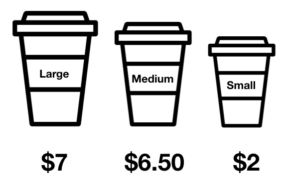
What Matvey recommends: “If you are still willing to add more than one offer, it would be a great idea to add an offer that is much more expensive or much cheaper. Why? This way, you can increase the value of YOUR offer. So if you showcase several items, make sure that the offers next to yours are inferior in terms of quality or price. And even if customers choose these other options, it’s a “win-win” for you.”
Read also: 9 Psychological Tricks to Increase Conversions and Make People Buy Your Popcorn
You Aren’t Using a Pre-Cart Landing Page
If you aren’t using a pre-cart or don’t even know what that is, your campaign is probably suffering.
Pre-carts are like pre-landers designed for eCommerce platforms. This page usually offers on a single item and clearly informs visitors that they will be taken to the cart/landing page. If used correctly, this technique can boost conversions and save you money by filtering visitors who won’t convert.
[FREE Webinar] eCommerce: How to Earn BIG with Holiday Season
The Page Isn’t Secure
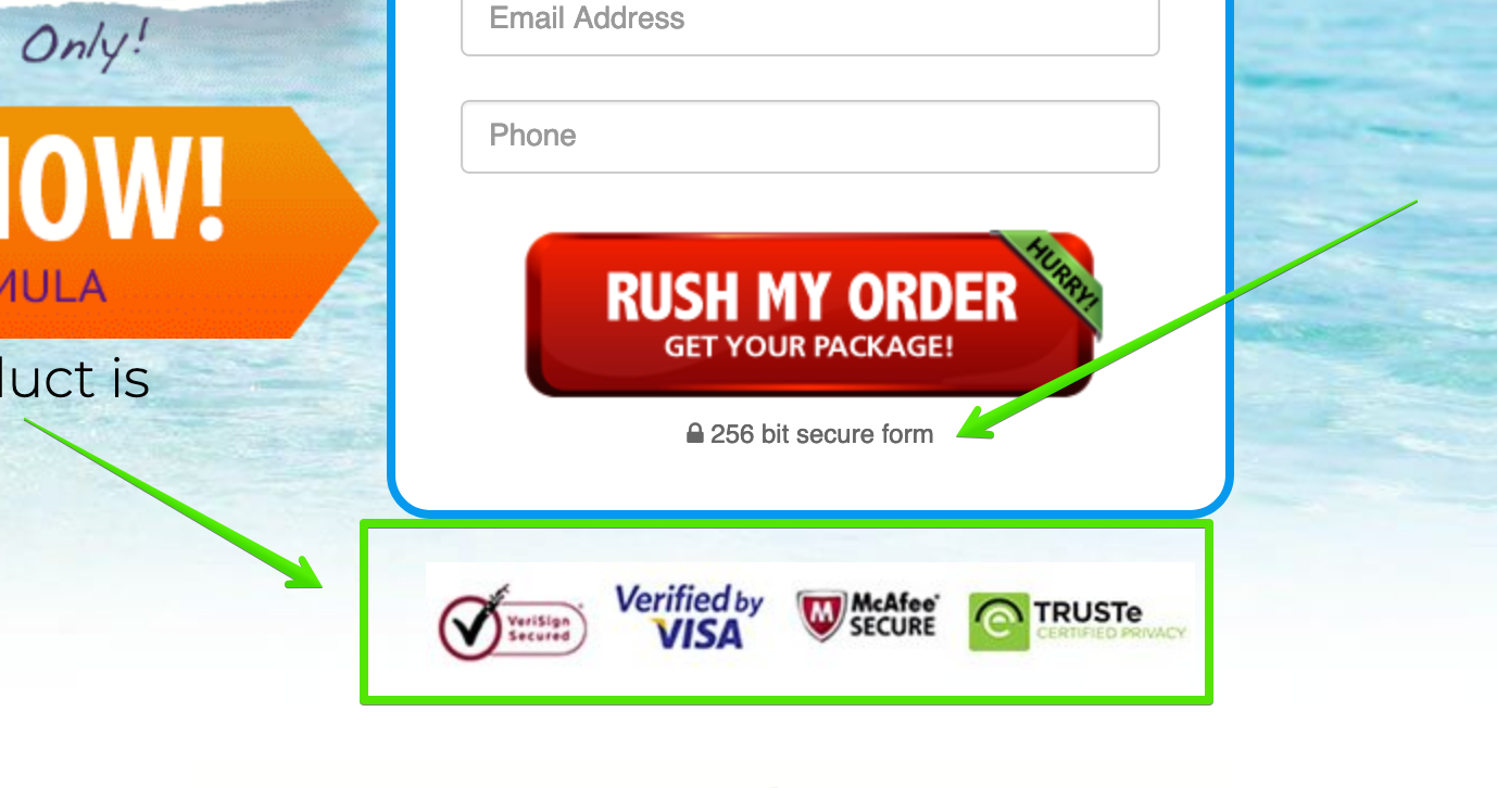
As any great provider knows, having cybersecurity measures in place is crucial for the safety of any eCommerce platform and its customers. What happens if you don’t? Customers won’t get anywhere close to your cart and will click out of the landing page as soon as they can.
Moral of the story? If there is one thing on this list that you have to do at all costs is upgrading any obsolete security measures and mentioning the list of measures that are in place to secure people’s money.
Visitors Don’t Feel a Sense of Urgency
Urgency is an essential part of a healthy eCommerce campaign and the idea should be reinforced in the LPs. If visitors feel like they will always have an offer available, they won’t make immediate decisions, which will affect your conversion rates.
Instead, use an active, suggestive language that gives your visitors a healthy nudge towards the desired action.
What Matvey recommends: “To make your offer seem even more attractive – add timers. As well, most of the eCommerce websites/advertisers provide bonuses and discounts. This is the information you want to highlight. Discounts help boost your CR.”
The Technical Elements Aren’t Sound
In addition to the above, it’s important to pay attention to the small, technical details that can make or break your campaign. For instance, always remember to include:
- A short URL or permalink that has the name of the product you’re selling
- High-quality photos of the actual product
- Concise ad copy that’s easy to read and adds value to your landing page
- Multiple CTAs strategically placed throughout your LP
Get More Tips for Converting Your Visitors
Competition in the eCommerce industry is fierce. But, if you take the time to optimize your LPs and break into the scene, it’s also one of the most lucrative industries you can participate in.
We need to talk… How about we discuss this article in our Telegram chat?
