6 Psychological Ingredients for High Converting Landing Pages
When it comes to creating a landing page that converts, there are numerous schools of thought out there. Things as simple as adding a number instead can increase conversions and clickthroughs by as much as 10%. But is this more luck than judgement, or is there some science to back it up?
To give you plenty of food for thought, I’ve boiled down the art of creating landing pages into just 6 key ingredients. Take the time to get to know them, implement them, and before you know it, you’ll be reaping the rewards!
Hero Images Work 60,000 Times Faster Than Text
If you want to start off a landing page with a killer headline, then think again.

Headlines are all well and good, but an image is recognized and analyzed by your brain up to 60,000 times faster. This means the instant you see something you like, you should be hooked — exactly what a landing page is geared towards.
Apple is a great example in so many ways, and as the world’s most valuable company, we shouldn’t be all that surprised. Every time they launch a new iPhone or upgrade the iPad they start with a hero image of the product.
By the way, check out our guide on how to optimize landing pages for mobile.
Granted, their design is so iconic that people already know what it is and it needs no introduction, but it’s a great visual, isn’t it.
Avoid clutter and flashing headlines because, to today’s browser, they just look like spam. Keep the starting point clean and begin with a hero image:
- Clean mono-color backgrounds will help your text and images stand out
- A simple, striking image is far more desirable than half a dozen flashing pop-ups
- If in doubt, follow Apple’s lead and create something that’s the polar opposite of spam
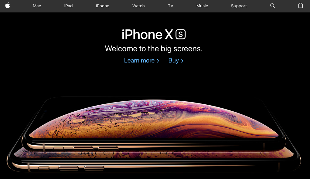
Example of a good hero image
Keep Your Text Short and Sweet
Nobody wants to have to read a mini-essay to find out what you’re talking about. It’s a major turnoff, and it’s not why people are online in the first place.
The temptation can be to put every single bit of information down that you can think of to try and beat the competition. Bear in mind that your readers are already giving you their attention, so you want to get your message across quickly and efficiently:
- Keep sentences to 20 words or less
- Slogans or subtitles should be shorter still
- Make sure your paragraphs are never more than 200 words
You’re also going to want to avoid the silly mistakes that every first draft is littered with. To ensure that you can create typo-free landing page copy, it may be worth making use of online tools such as OnlineWritersRating and Essay Supply.

Example of cluttered text
Shapes Speak More Than Words: 3 Fonts or Less Please!
Your brain doesn’t actually read every single letter or even all the words. What it does is scan ahead and try and cut corners so that you can do more. It’s a clever way to save computing power, but it also leaves itself open to a number of tricks.
A landing page needs to recognize that the brain spots shapes and patterns before it comprehends the meaning of words. Shapes convey different meanings, for example:
- Curves are friendly and welcoming
- Triangles are professional and goal-oriented
- Horizontal lines are calming and relaxing
The idea of shape recognition also applies to changes in font because you’ll recognize differences long before reading the text. Keep to 3 fonts, or fewer, so you don’t distract the reader.
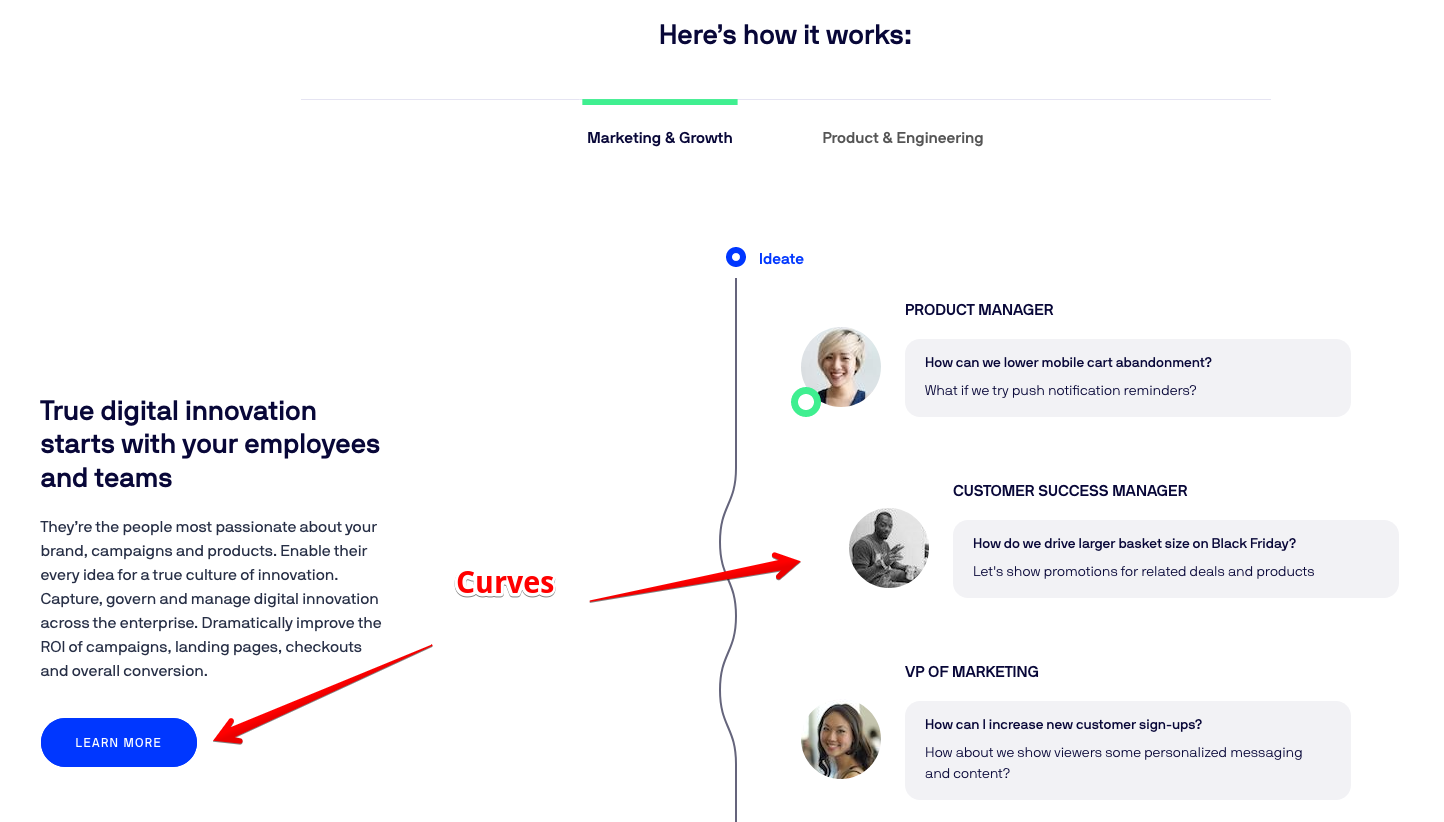
Example of curved lines (Optimizely)
Horizontal Structure Keeps You Calm: Take it Step by Step
The classic landing page should move from section to section, with each one delimited with a horizontal band. There’s a whole host of reasons for this:
- Your readers have come to expect landing pages to be formatted in this way
- It closes off all other avenues of distraction
- A reader won’t be torn between reading down or reading some offshoot text that juts out to one side
- You can create urgency as the reader moves down the page without sacrificing clarity
“I believe that you need to find the right balance between creating a sense of urgency, and giving your readers the ability to systematically make their way down the landing page. Horizontal bands of color and text that flow down the page are a tried and tested way to do that” — explains Christopher Mercer, a content creator at Citatior.
Example of classic horizontal structure
Combine Images with Emotions to Tap into Psychology
We’ve said how images are taken in far faster than text, but what else can they do?
- Images evoke emotions far more powerfully
- They are more engaging than even the most powerful hook
- You can use them to ask a question without having to write it
If you put a picture of an athlete sweating and toiling but looking happy whilst they do it then you’re asking the reader if they want to do the same. Of course, they do! They want to look and feel as good as the person in the photo.
This is psychology 101 because you’re getting people to identify with your content without even having to ask an explicit question. Once you create this level of buy-in, it’s easy to turn that connection into a conversion.
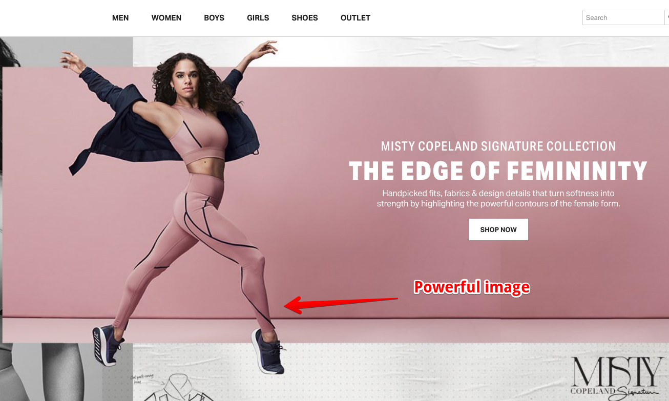
Evocative images that tap into the popular psyche
You Need to Embrace A/B Testing to See What Really Works
The final ingredient that every landing page needs is exposure to the real world.
By undertaking A/B testing, you can experiment with different colors, layouts, button sizes, anything you like really.

Change one thing at a time and then analyze the results. That way you’ll know for sure what caused the increase in conversions. You’ll soon arrive at a page that converts ten times better than the one you started with.
“I had an idea what I thought would work when I created my first landing page but I wasn’t that happy with my conversions. It wasn’t until I embraced the science of A/B testing that I was able to discover what actually works in the real world” — says Brian Watkin, a content marketer at ResumesCentre.
Final Thoughts
Creating a landing page is science, not art. By following the examples of major brands like Nike and Apple, you can get off to a good start. From there you’ll need to tap into people’s emotions with suitable imagery and discover the specifics of what works through a systematic round of A/B testing.
Join our Telegram for more insights and share your ideas with fellow-affiliates!
Trends
View more posts