The Reasons Why Your Native Ads Aren’t Working [Hint: Your Creatives]
One thing all major cities around the world have in common is the huge number of billboards and ads you see on the main avenues. Needless to say, most of these billboards fail to engage consumers because it’s obvious they are… well, ads.
Popular sites on the internet are very much like New York and other big cities. They usually have a ton of ads that are obviously trying to advertise a product, game, or app of some sort.
Unfortunately, the fact that these ads are so direct can raise the alarm and ultimately discourage consumers from paying attention to them.
The main reason why these ads don’t work is that consumers are not receptive to them. However, native ads have emerged as a viable format that helps advertisers connect with consumers at a deeper level without raising any alarms.
Actually, that’s one of the reasons why PropellerAds is now releasing new Native Ad formats, for example, Push Notification ads.
But hey! What are native ads and why are they so effective? Let’s take a look!
Display vs. Native Ads
You’re probably familiar with display ads because they are among the most popular digital formats available. These usually come in the form of banners, although additional display ads of different shapes and sizes may be placed throughout a website. At the same time, it’s clear these banners are ads, which means consumers usually ignore them altogether.
Native ads deliver content to consumers without raising alarm because they match the appearance and the general function of the website they appear on. The ads are cleverly disguised to look like the editorial content of the website, which is the reasons visitors land on a website in the first place.
Display and native ads do have some similarities, for instance, the use of images and other elements that help create awesome content.
… And that’s where the problems usually start for 75% of advertisers…
Choosing the Right Image for Your Native Ad
One image is worth a thousand words (“Yeah, I’ve heard that, been there, done that”) and, when it comes to Native ads, it’s an absolute must to have a catchy creative.
Actually, science can help us with making an image super-appealing.
There are several theories and accepted assumptions we can make about our visual perception.
Here you go:
Theory #1. How do we process the information? Our brain combines the visual information we receive with prior knowledge to ultimately interpret an image.
“Nearly 90% of what we see is lost by the time it reaches our brains. Because of this, the brain has to make its best guess based on our past experiences or prior knowledge,” according to Pictochart.
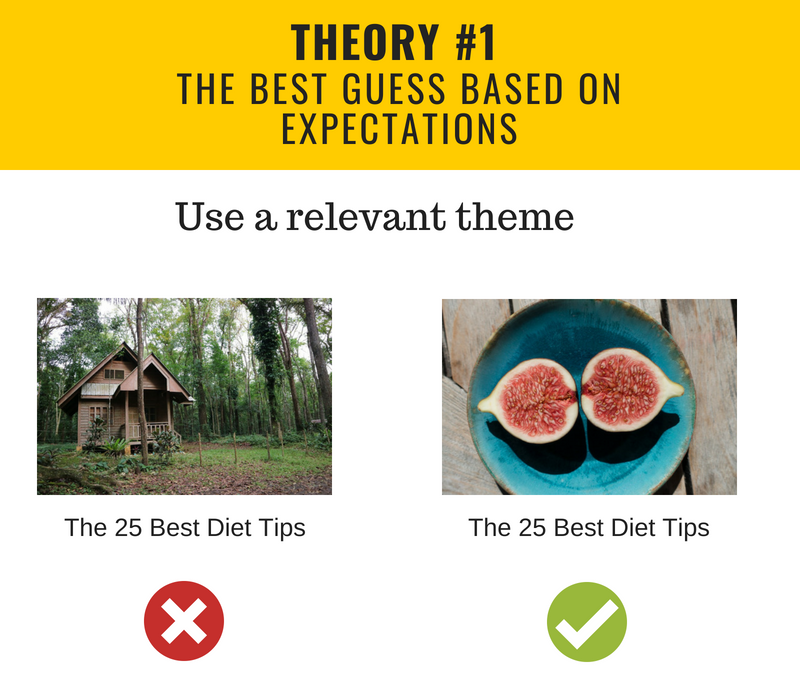
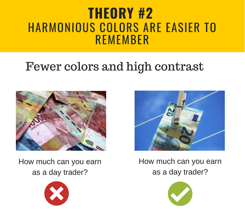
Theory #2. Elements that have similar colors are easier to remember, but they need to have high contrast with the background in order to stand out.
Sounds difficult? Let’s break it down into simpler parts:
- If you have a busy image with much detail try using fewer colors.
- High contrast between the background and the text.
- Do use harmonious colors for a visually compelling look. “Сolor harmony increases both subjective pleasure and objective capacity for holding colors in mind,” as it’s stated in Thomas Sanocki’s and Noah Sulman’s research.
- If you use disharmonious colors, make sure you know why you are doing that.
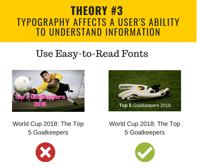
Theory #3. The typography or font used affects a person’s ability to process and understand information.
MIT psychologist, Kevin Larson, performed an experiment to find out whether “type choice, layout & line spacing could have an impact on the reader’s emotional state.” The result was pretty surprising: “The viewers who read the poorly designed page were negatively impacted, expressed feeling bad, and would even physically frown.”
Here are the key takeaways:
- Opt for easy-to-read fonts. Well, because you want people to read your message, right?
- Space out text and visuals.
- Do not place images or icons in between texts.
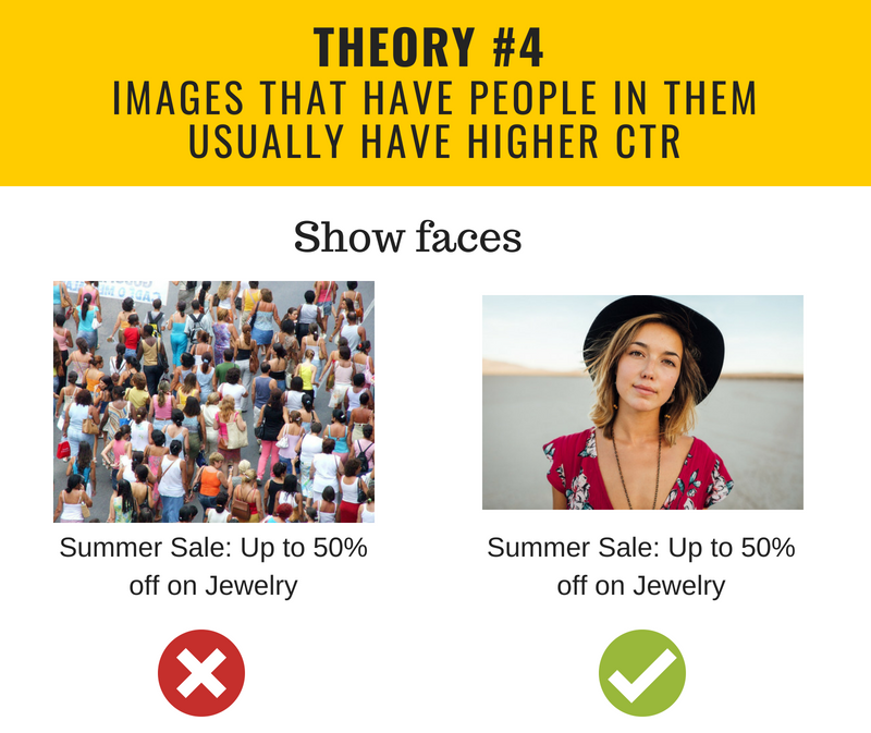
Theory #4. Images that have people in them usually have higher Click-Through-Rates.
As stated by the research project from Georgia Tech researches and Yahoo Labs: “Human faces are powerful channels of non-verbal communication.” The research team revealed that photos with faces have 38% higher engagement levels than pictures without faces.
Check out the data on eye-tracking heatmaps by Business Insider.
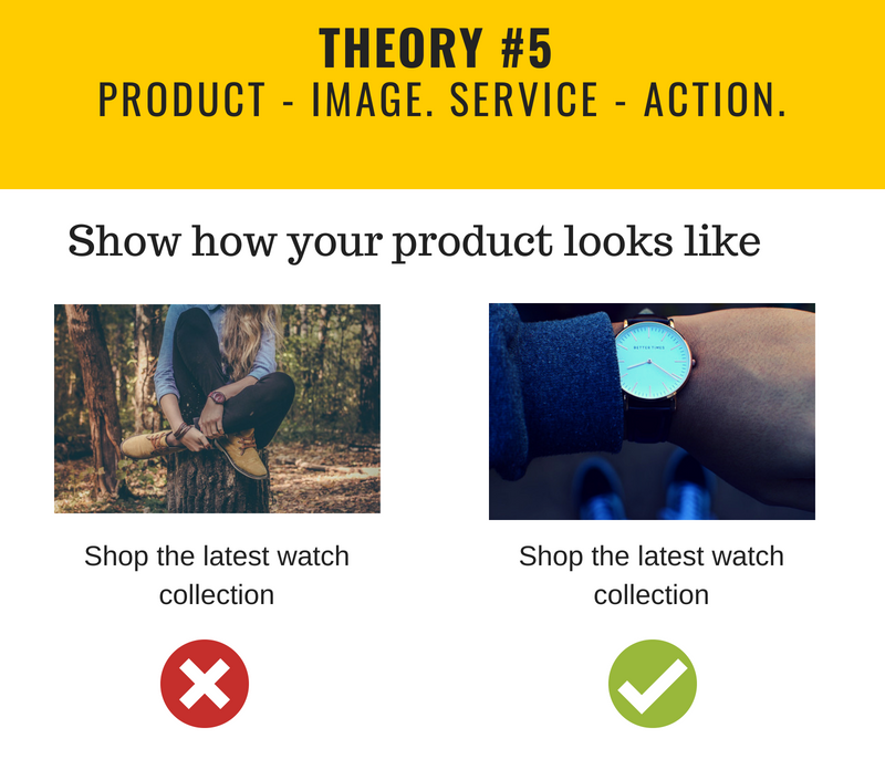
Theory #5. Selling a product – show it. Selling a service – show the action.
Probably you would agree that selling a product without actually showing it, is quite difficult. So the rule of thumb here is: if you are trying to sell a product – show the image of your product. But what if you are not into tangible goods and you are more of a SaaS person? Go ahead and explain how users are interacting with your service, in other words, show the action.
Where to Find Images?
When it comes to sourcing the actual image, you can select from different sources. These include:
- Stock Photos
While many avoid using stock photos because they are too generic, these images offer a good solution if you’re trying to stretch your budget. Be creative and smart about how you use them that consumers know they’re stock photos, but they won’t mind if they are used in a witty or original way. Try Shutterstock or DepositPhotos, or find free images at Flickr and Pixabay.
- Graphs and Charts
Charts and graphs help deliver statistics in a memorable way, which is extremely important in technical or how-to articles. Besides helping consumers remember the numbers, they usually come in a bunch of funky colors that make your native ads look very attractive.
- Screenshots
Screenshots help consumer visualize instructions, boosting their engagement while delivering great content simultaneously.
- Still Frames from Movies and Series
Pop culture images are loaded with implied meanings, which is the main reason why memes are hilarious. (But be careful with copyright)
- Custom Photos
Somehow many advertisers forget that they can take a picture of the products with their own camera.
Native Ads Text
It’s important to note that native ads also have a text component. And despite the fact that images may be more effective, the right ad copy will make a huge difference to the success of your campaign.
Here are some text styles you may want to implement in your native ads:
Personal Experiences and Stories
Remember that native ads are designed to seamlessly integrate with the website content or a user’s personal feed (that’s the case with Push Notifications). Writing an engaging personal story or narrating an experience can build a personal connection and spark your audience’s interest.
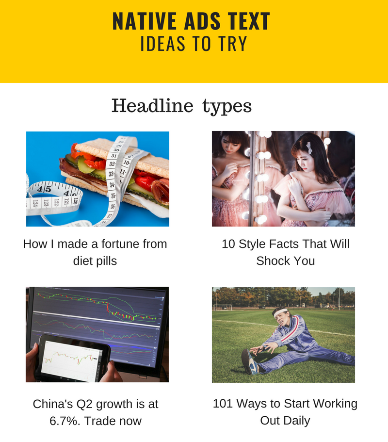
“How I made a fortune from diet pills”
“This is how I learned to trade Forex”
Questions and Trivia
Instead of going for deep emotions, you can play on your audience’s curiosity by using questions or trivia-style texts. This will work best with light-hearted industries and functional products.
“10 Style Facts That Will Shock You“
“Betting Tips: How to work out the correct score“
Intrigue
Similarly to trivia, intrigue plays on people’s curiosity to spark their interest, and you can employ this technique as long as your audience and product allow it.
“How Cutting Out Sugar Can Add 10 Years to Your Life“
Listicles
Listicles have become a fountain of information for consumers. We are so used to taking in huge amounts of information so quickly that our brain processes headlines and short jolts of information naturally, which makes listicles extremely effective for awareness campaigns.
“101 Ways to Start Working Out Daily”
News Release-Style
News-style native ads need to be particularly slick and powerful. Folks looking for information tend to be very picky about the source, so make sure your ad does not mislead and that the information you are delivering is valuable.
“China’sQ2 growth meets expectations at 6.7%. Trade now!
Ready to put theory into practice? Check your creatives or build a completely new campaign, using these tips. Here are some more article that can help you find an inspiration: A strategy for Native Push Notifications and Quick tips on how to optimize your landing page for mobile.
