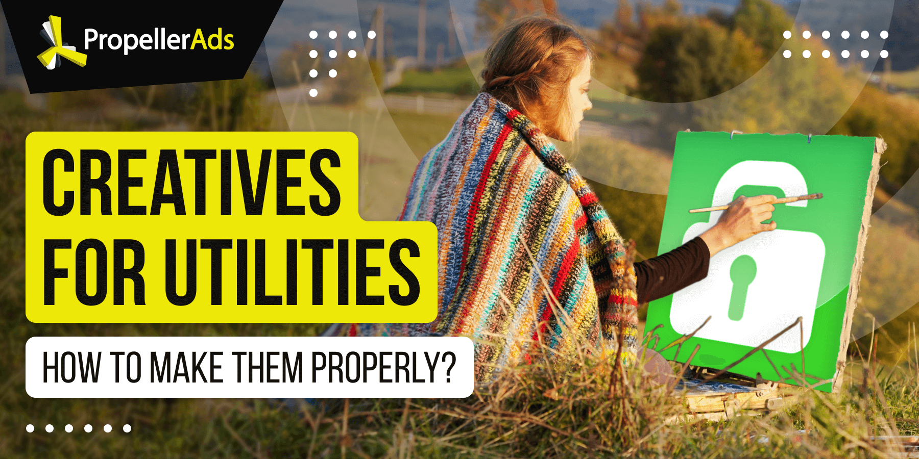
How to Make Converting Creatives for Utilities: Dos and Don’ts
This post is also available in:
![]() PT
PT ![]() ES
ES
Being one of the most profitable and therefore – popular affiliate marketing verticals, Utilities is a great choice for pros and beginners. Utilities are diverse, appropriate for different GEOs and occasions, and relatively easy to promote.
Of course, the heart and soul of any campaign are creatives. They are important. How to make them really clickable? How to pass moderation without a hitch? And most importantly – which mistakes to avoid? You will find answers to these and other questions in today’s post.
Okay, which visual elements suit particular offers?
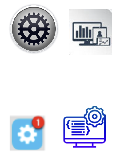
The first thing your creative is going to depend on is the type of Utilities offer you choose. For all of them, you can always use something generic, like gear wheels and wrenches, but you can go more precise and create something niche-specific. Let’s see which options you have:
Antiviruses
We all know that antiviruses are created to help users keep their devices safe from threats. As their main function is protection, your creatives should reflect it. Like this:
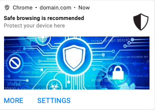
The main idea of the offer – protection and safety – is expressed in this banner fully. Both pictures and text explain what exactly is offered and why it is a good idea to have an antivirus (safe browsing, ofc).
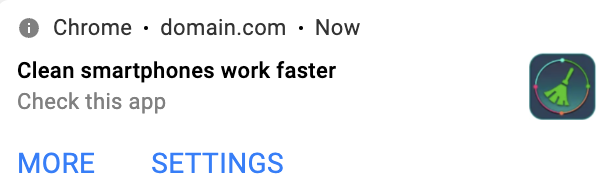
Cleaners and boosters
Cleaners and boosters are all about cleaning devices’ cache to make them work better. So, in addition to something basic and general, like gears and stuff, you can also use everything connected with cleaning, like brooms and brushes.
Ad blockers
For ad blockers, our partner affiliates usually use something like this:
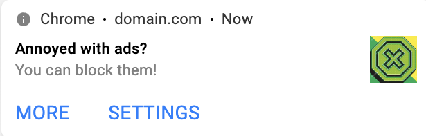
Or this:
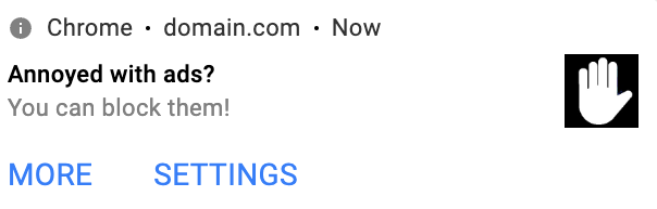
Crosses, hands, stop signs – everything associated with blocking will do.
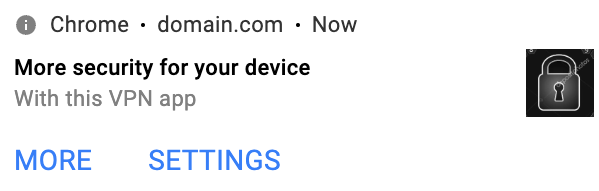
VPNs
VPNs are about safety and anonymity, again, and about access to limited content, like video streams, media files, and more. All kinds of shields and locks will do:
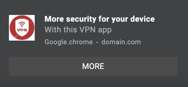
Or like this:
At the first glance, it doesn’t seem too complicated, right? Well, now let’s go a bit deeper and discuss some very special nuances.
Good and not good: how to understand before you launch a campaign?
So, what are the dos and don’ts for your Utilities creatives? Let’s get right into it.
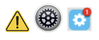
Make icons recognizable and don’t make them too complicated and detailed. No matter which offer you have there – be it a cleaner, VPN, antivirus, or anything else – make sure users understand what you are offering. Avoid too complicated pics, which is especially important for Push notifications.
Which ones are better? Definitely, the first ones are simpler and therefore – they are clear and not overloaded. So we do recommend using something same-like.
Make your design look professional and valuable, but avoid scary ads. Utilities and Software require a neat and somewhat reserved style – this way, you increase credibility of your offers.
As for the scary ads, well, they rarely pass moderation, so you should rather avoid them. Using scary ads is unethical and sometimes – misleading. What is more, users don’t really like them and oftentimes they complain and report abuse (especially, the iOS users).
If people report your ads, the advertiser’s app can be banned. As such, he will get his finances frozen and most likely won’t pay you.
What is more, ads with scary images and copies might get significantly less traffic because most publishers don’t want to have such banners on their websites.
And which ads are scary? There are… let’s say, different levels of scariness. For example, here is the slight one, just a little-bit-scary ad:
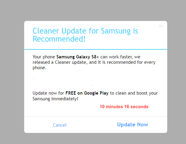
What makes it somehow scary is the timer. It’s not critical, but it’s already a bit scary, so mind that when creating yours. You can still use it but try not to overdo it.
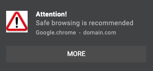
This is a scary one because of the exclamation mark and the alarm sign. It’s already anxious:
And here is how a super-scary ad looks like and you should totally avoid using something like that for your ads (please mind that PropellerAds doesn’t accept scary creatives, like this one):
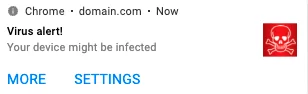
To pass the moderation, you shouldn’t use super-scary ads like skulls and disturbing texts. Instead, stick to less scary ones – you can still use the red colors to attract attention and even put exclamation marks but without heating it up too much.
For instance, if you really want timers, you can try writing “two days left” instead of “5 seconds left” so as not to make users panic. Remember that skulls, toxic signs, and other anxious stuff is a no-no in 99% of cases.
Use thematic images instead of branded icons. All in all, remember about the copyright. You can always get some free stock photos for your ads, but it’s better to avoid Android icons or logos of existing Utilities brands, unless you are promoting this exact brand, of course. This will definitely save you from getting banned.
Try to avoid too much alarming language. As for the copies, your task here is to keep your banners balanced. On the one hand, you have to motivate users to act, but on the other hand – you should keep away from using scary strategies.
What is allowed? All of those soft wordings like “your device might…” or “it is recommended to…” instead of “your device is in danger…” and other affirming statements. Suggest, but never insist.
Testing your Utilities creatives
- Test all the elements separately. First, you test the icon, then you test a banner image, then – a copy. This means that you launch campaigns with different elements you would like to test. Once you find the best-performing icon, you test it with the set of banner images and then move to the text part.
- Not just different images, but also – different concepts. What does it mean? If you are going to test three pictures of shields colored differently, this won’t give you too much information about which one is efficient and why. Instead, try pics that impact users’ perception differently. Say, here is a pack to test:
Palette can be decided after you test three different images and find the best one. Then you can experiment with the colors.
- Test copies after you find the best image. Now when you have the most CTR-boosting visuals, you can move to the text part. Again, with text, you should try completely different wording. After you test and find the best one, you can move to the smaller details: adding emojis, symbols, exclamation marks, question marks, etc.
Conclusion
So, our excursion is over and now you know pretty much everything about Utilities creatives. Mind the main points:
Your icon should express what exactly you offer. Don’t make your users wonder – they need to understand what you are promoting from the very first sight!
Keep it simple. Avoid taking detailed images with various elements – they will make your ad look messy and unclear.
Be very careful not to make your ads scary. Keep the balance between attempts to evoke actions and making your users anxious.
Don’t use branded images. Try something thematic or/and offer-relevant. Avoid icons that belong to certain brands.
Test all the elements separately. First – test icons, then – banner images, and then – copies. Find the best combinations and test them to find the best-performing one.
Grab these recommendations and make your banner a real work of art! Good luck with your Utilities campaign!
Do you have any insights about Utilities creatives to share? Jump into our Telegram chat – let’s discuss!
Trends
View more posts