How to Optimize Landing Pages for Mobile
Having to “pinch and zoom” to see content better on your mobile phone is a thing of the past.
Today, non-optimized websites get a big, fat X when visitors see hard to read text, misaligned images and impossible-to-click links and buttons.
The same applies to landing pages. A non-optimized mobile version will make the visitor feel unwelcome and literally unable to do anything. For this reason, it’s incredibly important to optimize your landing page for mobile-friendly viewing.
Why your landing page needs to be mobile optimized
Statistics have reported that in 2015 there were about 120 million mobile users in the U.S. alone. It was projected that this number would increase to a whopping 162 million by 2019.
In a SurveyMonkey and iAcquire study of mobile shopping behavior, it was found that:
- About 70% of all mobile searches lead to actions within an hour.
- 40% of mobile viewers will exit and find another website if the first site isn’t mobile-friendly.
This means that 4 out of 10 visitors will exit your landing page and go to your competitor if you don’t make it user-friendly on mobile phones.
Now you know how important it is to switch to a mobile-friendly version. But how do you do it? How do you optimize your mobile landing page and get a higher conversion rate?
Take a look at these quick and easy actionable tips below…
#1 Speed
Take a quick look at your landing page and see how many objects are needed for a complete page load. How many design elements are used?
Having loads of design elements may dazzle the user, but chances are that they won’t wait for it to all load up. Instead of loading it up with gorgeous design, why not opt for speed?
A mobile landing page is meant to quickly grab your audience’s attention and never let go. A slow-loading page will turn off most users. Every second counts, and sometimes a second is all you need to get a visitor to take action.
In a Soasta case study, it was found that a website that has a 2.4 second loading time experienced a 1.9% conversion rate. Desktop versions have an average conversion rate of somewhere between 2 to 3 percent. Pages that took a second longer to load experienced a whopping 27% decrease in their conversion rate.
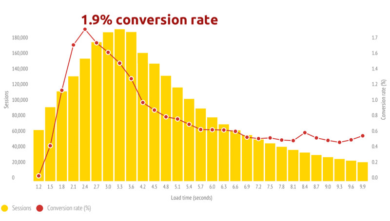
There are plenty of ways to speed up your landing page. First, you can scale your images accordingly so they are quicker to load. If possible, enable CSS and HTML file compression to reduce the size down from 50 to 70 percent.
Do you have flash content or other similar plugins? These could be slowing down your landing page as well. It’s better to leave them out and go for simpler images or videos because the flash content isn’t always compatible with a viewer’s mobile browser.
#2 Keep those forms short
Let’s imagine you’ve seen an ad for a marketing tool that you liked and tapped it on your mobile phone.
Understandably, you’re redirected to a landing page.
But what’s this? You’re faced with a form that has a dozen fields!
On a mobile phone, no less. So you do a double take and think “Nope”, close the site and walk away.
Chances are your customers will do the same.
Your mobile users will be most likely outside, in a hurry and won’t have the patience to fill up a form that has a dozen fields or so.
Here are 3 tips for improving your forms on mobile:
- Don’t overwhelm your visitor. Go for a minimalist vibe and ask for their email address (or the most important info).
- Get an autocomplete feature if you really have to put in lots of fields. Both Safari and Chrome have it, and it’s also on the iPhone settings if the user has it enabled.
- Make the form appear shorter by eliminating as much space in between fields as possible. Your customer won’t have to scroll as much or do a double take in filling out the form.
#3 Don’t expect them to do too much
On the mobile platform, it takes considerable effort to convince your visitor to take one action. But having them do two or more is just asking for trouble.
Read more: 6 Tips to Create an Effective Landing Page
All the elements on your mobile landing page, i.e., the CTAs, text, image and action buttons should have something to add to your primary conversion goal.
Here are 4 tips to improving your CTA:
- Have a single, large Call To Action that has a compelling copy. Make it thumb-clickable.
- Your CTA button must be in contrast with your landing page color scheme.
- If having multiple CTAs is an absolute must-have, then the primary conversion goal should be placed at the top of the landing page. Put the second CTA a bit further down and space it out evenly.
- Try a phone number as a CTA and place it right at the top of your mobile landing page.
#4 Check it out yourself
The goal of mobile optimization is to provide a seamless, easy viewing experience for your visitors. So it makes total sense to try and see it in your customer’s perspective.
Here are 2 tips to replicate their experience:
1. Use a mobile phone emulator.
Get a mobile phone emulator by visiting www.mobilephoneemulator.com. Here, you can select various viewing elements such as screen size, handset model, and preferred web browser. Then, point the URL to your landing page in Website to Emulate to see your page in action.Check Your Google Analytics data.
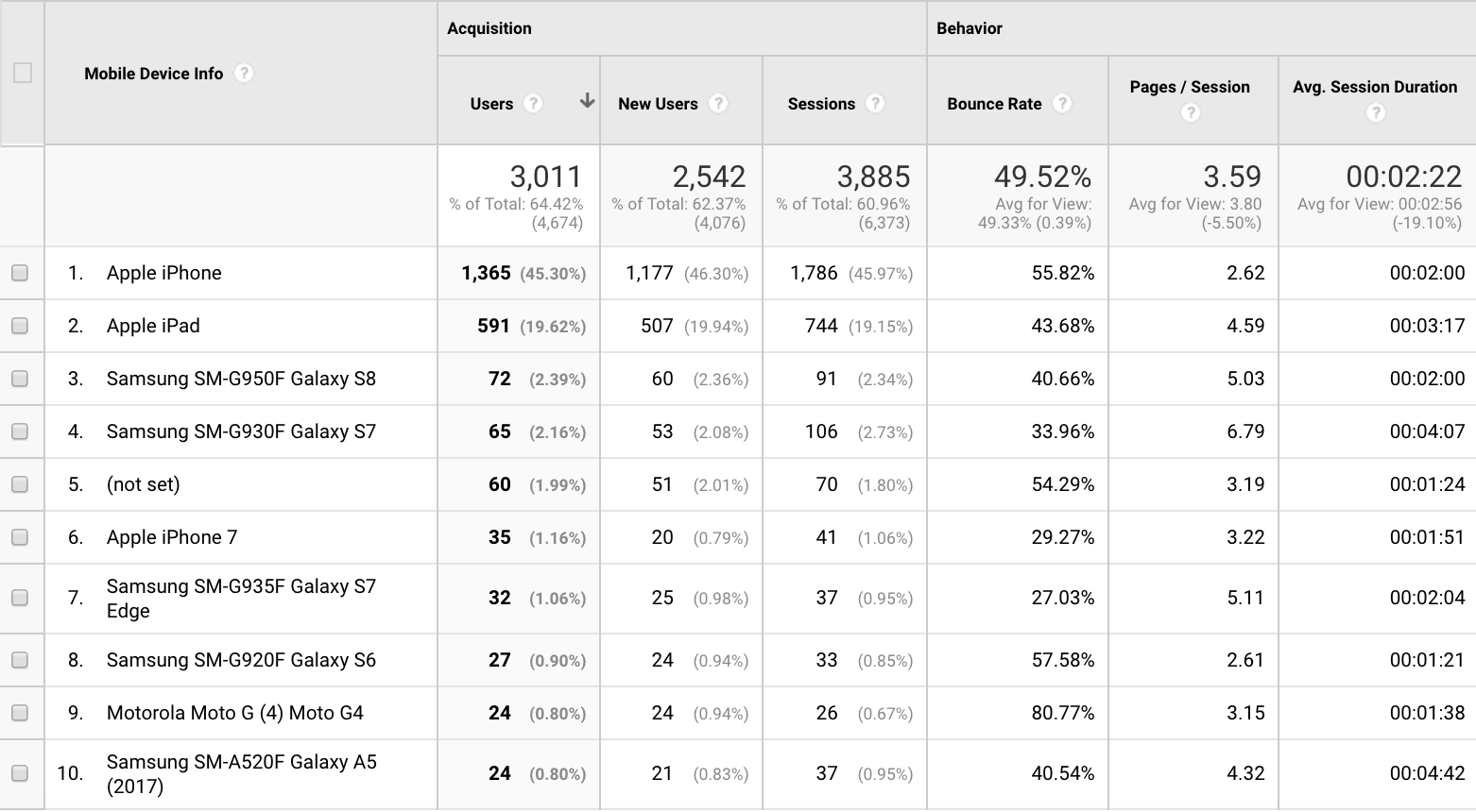
2. Google Analytics allows you to see the most common mobile devices your customers are using. Do a website test for the 3 most-used mobile phones and see if there are any issues or hiccups.
You can find this information in Google Analytics by going to Audience > Mobile > Devices.
Need a high converting landing page? Then it’s absolutely important to focus on optimizing it for mobile users.
Do your research to find out who your audience is. Then, give them what they want by providing information they can use. It’s as simple as that!
I hope that these tips help you in your quest to build the best mobile landing page. I’d recommend taking one element in your low-performing page and do some split testing. This will help you get a higher conversion rate, and therefore achieve greater success. Good luck!
