How to Boost Conversion With One Image on Your Affiliate Landing Page
This post is also available in:
![]() PT
PT ![]() ES
ES
While success in affiliate marketing is often not about any particular channel, an affiliate landing page is a critical element to consider for promotion. It presents potential affiliates with your offer and invites them to partner with you; it moves the audience to action, to sign up for promoting your products or services.
For affiliates joining the programs to get recurring affiliate commissions, landing pages work too.
One way or another, the affiliate landing page design is what influences conversions greatly. Along with attention-grabbing headlines, lists of benefits, and clear CTAs, a hero image is a critical element to consider for positive results.
What is it, and how to use it at affiliate landing pages to boost conversions? Keep on reading to learn the magic!
What is a Hero Image?
A hero image is a large, featured picture, series of photos, or video that dominates your affiliate landing page.
Given that it’s the first thing a user sees when landing on your page, a hero image should present your product in the best way possible, conveying its value, context, and emotion.
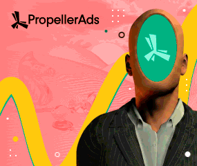
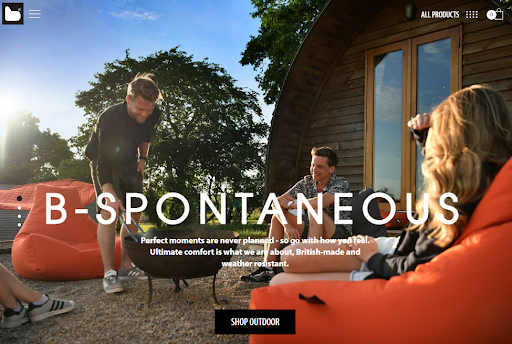
Here’s the example:
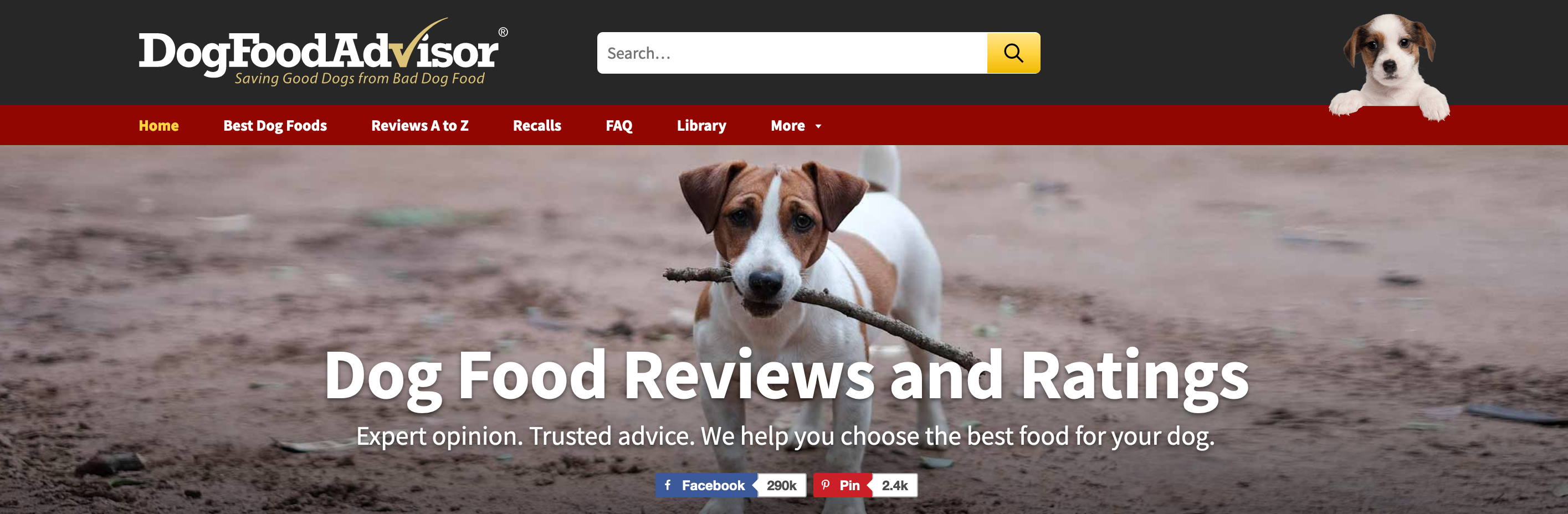
The purpose of a hero image is to educate and persuade a customer. It’s not simply a big, bright photo on your landing page; it’s a photo complementing your value proposition and providing clarity to your page visitors.
And given that the human brain processes the information through images, — that’s why content with engaging images gets 94% more views — great visuals with a purpose are the key to high conversions.
Types of Hero Images to Consider
Marketing experts haven’t yet agreed on a particular number of hero image types. Some specify three, others insist on four, and a marketing influencer Neil Patel takes it a step further and writes about seven types of hero images:
- 1. Product
- 2. Contextual (Process-focused)
- 3. Emotion-focused (Outcome-focused)
- 4. Founder-focused
- 5. “Behind-the-scenes”
- 6. “Action shot”
- 7. Benefits-focused
Speaking of affiliate landing pages, the first three types of hero images from this list will work best.
A product hero image is the one showcasing your products. It can be static or demonstrating your product in action, but it needs to complement a product’s value proposition. Such hero images work best for conventional products: gadgets, furniture, pet products, goods for fitness (equipment, accessories), and others.
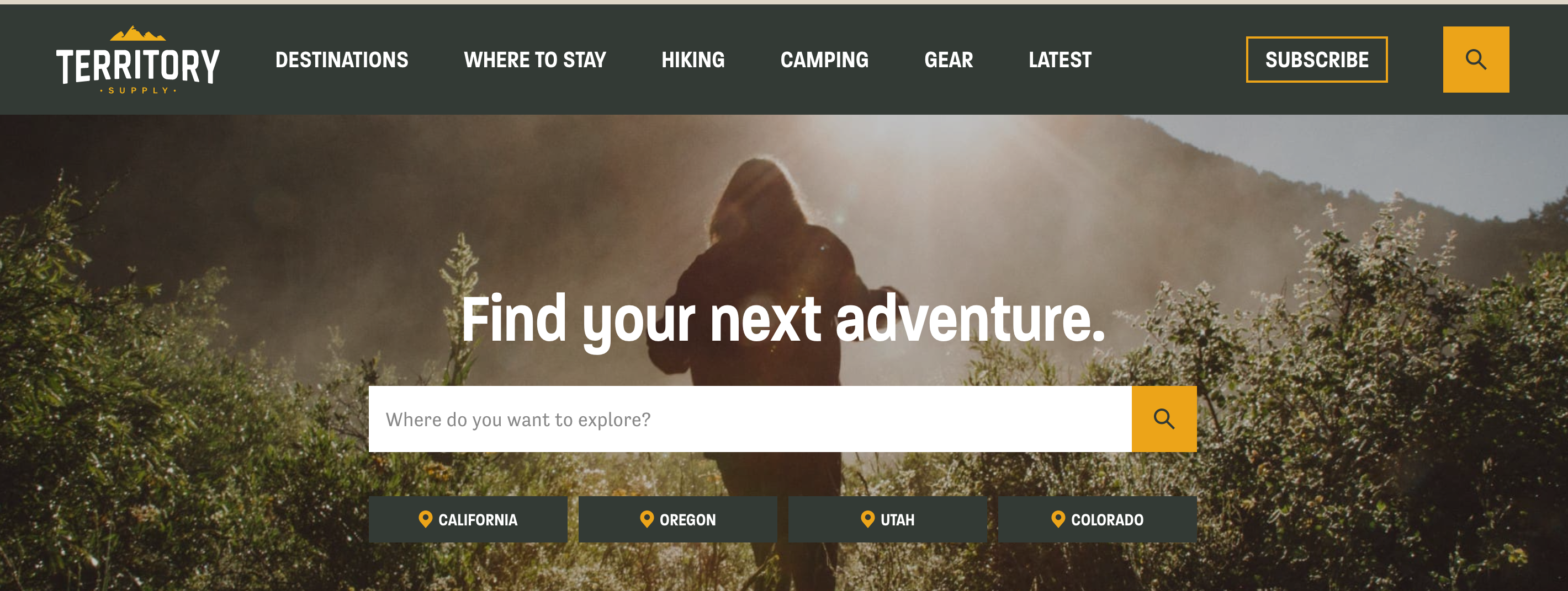
A contextual (process-focused) hero image is the one showing how your product works or providing context for it. For example, it can be an environment in which a customer can enjoy the product.

An emotion (outcome-focused) hero image is the one emphasizing the effects of your product, demonstrating the transformation it will bring. Here you focus on emotions you want a user to feel. Outcome-focused hero images work best for non-physical products (games, financial freedom, dating), highlighting the desired result — a happy customer.

Why Design a Hero Image for Your Affiliate Landing
An affiliate landing page is not a place to write argumentative essays about the benefits of your promoting product. And it’s that very moment when “a picture says a thousand words” for a visitor.
First:
We know that it takes only about 0,05 seconds for a user to decide whether they like your website or not. That’s why visual representation matters: Studies confirm that 94% of the reasons users mistrust a website are design-related.
Second:
A hero image’s place is above the fold, which focuses 80% of user attention.
And finally, given all the above:
Hero images introduce your website’s clarity and ease of consumption. Users scan, not read web information, and a mere glimpse at a hero image makes your niche and offer clear and understandable. When a user sees a website that makes sense, they feel pleased and open to collaboration.
How to Know This Image Will Boost Conversion
Choosing a hero image for your affiliate landing page is challenging because it’s not only about mere promotion: It’s your instrument to build authority as a brand for users to trust you and listen to your recommendations.
Fortunately, there is a framework that helps you transform images into hero shots. You can hope for a conversion boost if the picture of your landing page follows these seven criteria:
- It’s visualizing or is relevant to the targeted keywords of your landing page.
- This image is clear enough for users to understand your page’s purpose and offer. To check that, show it to someone not working with you on the project and ask to describe what’s in there. Do their words align with your page’s purpose?
- The image fits the overall design of your landing page. Check its colors, contrast, size. Does it make your call to action visible?
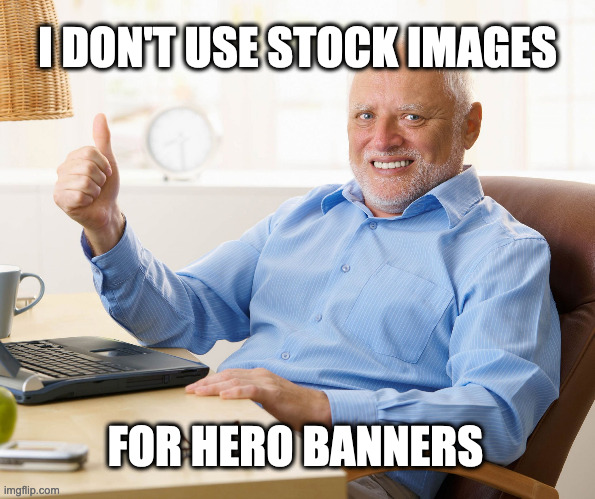
- It’s authentic. Do your best to use custom, genuine photos rather than those from stocks. Users don’t trust them, choosing actual and honest visuals.
- Your hero image provides added value: it answers questions, demonstrates benefits, or provides context for improved relevance.
- It evokes the desired emotion from consumers.
- It “says” to consumers they’ll become heroes once equipped with a solution you offer.
Sure, the best option would be to A/B test a few images to compare the results. Still, the above framework gives you a place to start, especially if you have no experience designing convertible visuals for websites.
And now, for more details:
Factors to Consider When Choosing Your Image
A hero image on your landing page should do two things: grab attention and showcase your affiliate product/service (or evoke the emotion that would motivate users to choose it).
And it’s not that simple to find visuals that could do both. The following five factors are your cheat sheet to use when choosing a hero image for your page:
Clarity
A hero image makes a visitor immediately understand the idea you want to convey.
So, do your best to satisfy customer expectations: stick to the “one image = one idea” rule.
If using a product photo, choose a hero image that would focus on it, not a founder or context. If you decide to select an emotion-based hero image, it will help if it resonates with the headline of your landing page. Thus, users will get the idea from the very first sight.
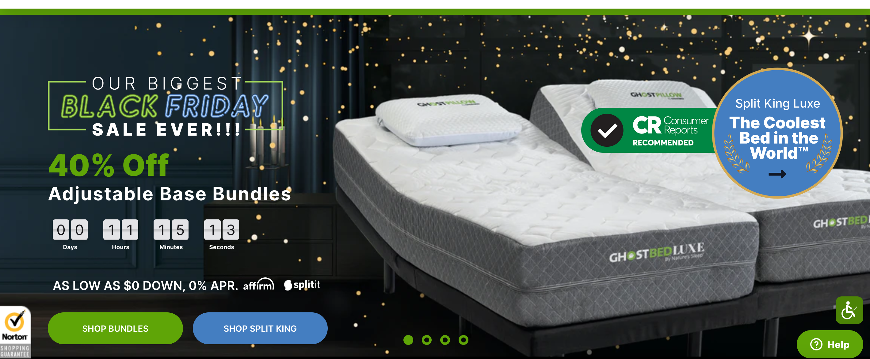
Example:
Colors
Only the lazy didn’t hear about color psychology and classifying the human brain’s responses to different tones. Remember that if planning to trigger a particular emotion from landing page visitors.
Yes, people will subconsciously judge your website based on the colors you use. If you’re an affiliate of one particular brand, you can use its color palette to evoke specific associations. But if you promote your affiliate website as an independent brand with its character and identity, its color palette is up to you.
A few rules here:
- There’s no one color that everyone would love, but, for some reason, blue is the one both men and women prefer seeing on websites. (Hello to Facebook and LinkedIn!) So, blue could be a relatively safe, neutral color for hero images.
- Whatever colors you choose, ensure they are contrasting for a hero image to stand out.
- If you place a CTA in your hero image, make it contrasting enough for people to see and click.
Power of Faces
Our psychology is so that we immediately relate to human faces, and that’s why some affiliate bloggers like Zac Johnson, Pat Flynn, and Missy Wald use their photos as hero images: It’s a clever trick to show the personality behind a website.
Feel free to use pictures with people’s faces as hero images. They can help guide visitors to your value proposition: According to studies, we naturally follow the gaze of others, so why not try a picture of someone looking directly to your CTA?

Consistency
This one is short and clear:
Do your best to relate a hero image to the rest of your affiliate website. It needs to reflect the values and principles you’re going to convey to the target audience, and it needs to be relevant to your niche.
Thus, a hero image of a person hugging his dog wouldn’t make much sense if your website is about gaming.
Also, remember the consistency of colors, tones, and fonts of your landing page. Make it visually pleasing and organized for visitors: Ease of consumption is critical here.
Persuasive Text
While adding text to hero images is not a must, it can amplify your brand message and motivate visitors to scroll further or learn more about your offer. A headline, a subhead, and a CTA with persuasive text are your extra chance to increase referral traffic for your affiliate partner.
Don’ts of Choosing Hero Images for Affiliate Landings
- Don’t use slides: Users will hardly check all images you put in there; the first one in a row gets the most clicks, so it’s better to focus on it.
- Don’t overdo animation in your hero image: It overpowers it, hogging your system resources, but it doesn’t influence user experience.
- Be careful with placing videos as a hero shot: You can never be sure if your visitors have a fast enough connection to play it automatically.
Takeaways
Hero images are not for big brands only. When done right, they can benefit your affiliate landing page and boost its conversion. How? By increasing the clarity and complementing your value proposition.
So, why not take the best practices of implementing hero images and see what works best for your affiliate website? But please try to avoid those stock photos of “call center” ladies or laptops with a cup of coffee.
Want to discuss this article? Go to the comment section below or join our Telegram chat!
Disclaimer. The views expressed in this article are those of the author and do not necessarily reflect the official position of PropellerAds.
Trends
View more posts