E-commerce Pre-Landers: How to Make Them More Converting?
This post is also available in:
PT
ES
If you want to make your audience perform a certain action, you need to make them willing and ready to do it. And that’s not always easy.
One of the tools you might find handy when defining marketing strategies that will lead to more conversions is definitely a pre-lander.
Now, you could say how the usage of a pre-selling page is not always a good idea regarding eCommerce campaigns. And you would be right.
But we’re here to help you figure out when a pre-lander is required and when it’s an unnecessary step in a funnel, how exactly you can use the pre-landing page when promoting eCommerce offers, and what are the best practices you can rely on, when creating eCommerce pre-landers.
Plus, we will analyze some eCommerce creatives together with professional Media Buyer, Serge Abramov, so you will know for sure what mistakes to avoid, and how to make your pre-landers more converting.
But first, let’s quickly run through some basics.
What are pre-landers?
Pre-lander, or pre-landing page, is where your audience will end up before being directed to the main product’s page. It’s basically an intermediate step whose main goal is to warm up the users before they are faced with a decision – to convert or not to convert.
When there’s uncertainty, the audience will proceed with a desired action (which in the case of eCommerce offers is always purchase), it’s good to include pre-landers and try to improve the campaign performance.
How do pre-landers work?
-
They capture the user’s attention
-
Provide extensive information about the product
-
Demonstrate results the usage of a product can bring
-
Showcase the extra value of an offer that follows (discount, for example)
All this should increase user’s interest in the product (offer), which will probably lead to more conversions.
“Pre-lands are used to ‘warm up’ the customer and explain why they need the product. How does the concept of pre-landing – landing page work? In the advert, we touch on the customer’s pain point, in the land we give more detailed information about the identified problem and lead to the solution of the consumer’s problem. This way, the customer comes to the landing page with full confidence that our product is the perfect solution to this issue” – is how ad network AdCombo sees the role of a pre-lander. They also added:
“So basically, pre-landings are highly recommended for offers that require a bit more explanation or have a unique value proposition. Also, if your traffic source is not strongly focused on targeting an audience with this problem.”
E-commerce and pre-landers: When they work well together?
We mentioned incorporating pre-landers in eCommerce campaigns is not always the best decision. What did we mean by that?
There are two main types of eCommerce offers – those of big online eCommerce platforms (like Shopee, Lazada, AliExpress), and single product offers. When running a campaign on an offer from popular platforms, you usually won’t be needing pre-landers.
Why?
Because users don’t need to be warmed up for these types of offers. At least in the majority of cases. These products are usually signed by a well-known brand users are familiar with, and they don’t need much convincing in order to convert.
“Based on my experience, eCommerce advertising campaigns often don’t include pre-landers. In most cases, there’s only a direct link that’s leading to the main offer”, Serge explains and adds:
“You still can use a pre-lander clearly, but what we suggest in that case is to make it simple – just emphasize the discount, for instance, and don’t overdo it.”
With single-product offers, it’s a whole different story. Usually, those are very specific products, intended for a specific purpose, like pet goods, body-shaping dresses, beauty products, etc. And with this type of offers, a lot can be achieved with a pre-lander.
“eCommerce pre-landers can be effective if the users haven’t heard about the product or the brand before. This gives them a chance to learn more about it before being faced with a decision to purchase it. Because before they saw it, users didn’t know they might actually need it”,
Serge said.
Pre-lander can come in the form of social proof (photos of before and after that will showcase the improvement the product in place can bring), or give an explanation of how the product works. With this approach, you are planting a thought in the user’s mind that this product is exactly what they need.
Here’s the comment from Paul Yoh Chin Poh, Senior Performance Marketing Manager at Indoleads, on when and how to use pre-lenders in an eCommerce campaign:
“I would recommend using pre-landers for eCommerce offers that sell home improvement or gardening products, like Leroy Merlin. Users looking for such products are always keen to read product reviews or learn more about the product’s usage, which is the main purpose of pre-landers.
Using pre-landers on beauty products could also boost the conversion of the landing page. A good pre-lander with video reviews on beauty products could increase the buyers’ confidence to buy on the landing page.”
And while we are at the topic of beauty products, we suggest you pay attention to what AdCombo advises:
“What can you use as a pre-landing page? Newsfeed format, personal blog, research.
Adcombo specializes in Nutra products. So let’s take skin as an example. The presence or absence of pre-landing depends on the traffic source we use and how prepared its audience is.
They are beneficial for products that have a significant emotional or visual impact, where customer testimonials, before-and-after images, and detailed product explanations can greatly influence purchasing decisions.”
eCommerce pre-landers: Best practices
- Shape them to target specific audience
Clearly, when working on a pre-lander you need to identify who you are targeting and to establish what are the pain points of the audience you want to attract. It is a good recommendation to check the popular search queries and define your strategy based on the info you get from this.
- Choose wisely your hero image
The very first thing your users will see needs to exude the desired effect. Hero image should be attention-grabbing and focused on products’ benefits or illustrating a special offer. Make sure to pick a memorable creative that will hit just the right emotions with your users, while providing some clarity on the product or offer in place.
Here’s an example of a good pre-lander:

- Invest your time in writing the copy
Yes, people are visual beings, and the image you’re using will most likely do the majority of the work. But a pre-lander should contain extensive info on the product’s benefits as well. We advise you to make it as simple as possible, and to use clear formatting – bullet points or number listings.
Here’s an example where the copy isn’t bad, but could have been better. The first part mentions some crucial benefits, but it’s written in small font size and within one sentence. We suggest splitting it into several bullet points and facing users with what they can count on right away. The second part is more obvious:

Note: When it comes to headlines, they should be aligned with the brand’s main message, but also eye-catching.
- Use social proof to build trust
Customer testimonials are always a good idea. Preferably the ones that come with images to illustrate the results (before & after). You can also use customer reviews, or even better, celebrity client’s comments (if allowed) to prove the brand is reliable and the product is working what and how it’s supposed to.
- Mention the brand’s history
When the audience is not very familiar with the brand, you can introduce it a bit via pre-lander. This could help with answering some of the most common questions the users might have and make them not see the brand as an unknown one anymore. It’s less likely the audience will convert when they know nothing about the product owner.
- Include clear CTA
You want your users to proceed with purchasing the goods, so you need to take them to the landing page. With CTA saying “Learn more” or “Purchase now” you will send them a clear message. Just place the CTA so it’s hard to miss.
If you’re looking for some additional tips, Indoleads and AdCombo have a few.
Indoleads: “eCommerce users are always looking for good deals. The easiest way to make the pre-landers more converting is to include compelling offers in your header with a catchy image below.
Another tip is to highlight the offer benefits with the pre-lander. Besides discounts, eCommerce users are most concerned about delivery and service quality. Highlighting these benefits will boost the users’ confidence to buy from the landing page.
And finally, you can use countdown timers and a CTA button in the footer of the pre-lander. By creating the sense of FOMO (fear of missing out), it will usually boost the conversion rate.”
AdCombo: “A landing page (or pre-landing) is not enough to get a customer to buy! Therefore, it is advisable to use engaging content. We particularly want to emphasize blog-type feeds where people talk about their experiences.
We have seen a trend in the successful use of pre-landing pages + landing pages (where both have a warming story and a detailed description of the product/service). So, a tip: At the end of the pre-landing, the customer has the opportunity to order a product. Fewer clicks – higher conversions.”
Creatives to use/not to use within eCommerce campaigns
Let’s dive into the world of eCommerce creatives and see what would work best for your campaigns. Here are some examples of creatives that have been used for this type of offers. Serge Abramov commented on how effective or non-effective they are, and what should be added in order to increase the conversion rate.
You can use these ideas and suggestions when building landing pages, pre-landers, or even when thinking about what image to include in your Push notification.
Example #1

Serge: The very first thing I noticed is these colors – it’s all purple, just in different shades. I believe this isn’t very effective since it’s not very catchy. But the fact the brand is offering an 80% discount, which is a lot, could make people want to learn more. However, adding an image of the product, as well as the name of the brand, would be much better. Also, we need info on sales duration.
Example #2

Serge: This one I find to be okay. It’s clear what the product is, the price is there, as well as additional info on the number of shoes. But adding a coupon on these creatives is only effective if there’s a deep link implemented in the coupon code. Only then, when clicking on the link, the user will receive the discount coupon. Otherwise, users will have to remember the code before moving on to the next funnel step, and that’s not practical at all.
Example #3

Serge: Now, this is a very bad example of eCommerce creative. This can be effective only if you’re targeting a very specific and narrow audience. It’s not really clear what’s the offer, and the colors used are not helping. The creative is just too boring. I suggest adding a discount amount, or the price of the product. More information is an absolute necessity.
It’s the same with this creative:
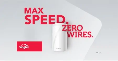
Honestly speaking, this type of creatives still exist because companies are focused on spreading brand awareness. And they often see this as the right move. But it’s really questionable how effective a creative like this can be.
Example #4

Serge: Here are examples of creatives that could be used for some weight loss products offers. And even though they both can be effective, the second one is better, given it’s showing the result. It’s demonstrating what the usage of the product can do. And that can be very stimulating for users. It would be best to add a real testimonial written in the first-person point of view.
You should bear in mind that this type of advertising is not always allowed. Facebook, for example, officially prohibits the usage of before-and-after creatives. Apparently, it’s because this social network considers it misleading due to idealized results.

When stumbled upon these creatives that are used for skin care product promotion, our thought was that creative number 1 would be a better choice than creative number 2, given the lady in the first image looks more natural, while the woman in the second image has obviously been heavily edited (the skin looks unreal). But this is what Serge said:
“Actually both creatives could be a good choice. They should be tested, of course. But the first image is a bit better because the woman is looking straight into the camera. However, for this type of product, it’s always best to use a before-and-after approach. Maybe it’s because of the television advertising and its effect, but it looks like people respond better when they are faced with a contrast. So, in this case, the creative number 3 is what could lead to most conversions since it illustrates the process of change.”
Note: Bear in mind that creative number 3 probably would not be allowed on all networks for the same reasons Facebook is naming in their policy (e.g. images that could make people feel negatively about the way they look, or supporting insecurities to conform to certain beauty standards).Final thoughts
In the end, let’s go through the list of “occasions” that would call for eCommerce pre-landers. They don’t need to be, or even shouldn’t be, a constant step in your campaign flow. Consider using a pre-lander when:
-
There’s the launching of a new product on the market – a perfect moment to represent all the benefits and possibilities that the item brings
-
You believe a pre-launch campaign could increase interest in your product – creating this sort of buzz before the product is available for purchasing can evoke interest; users will be keen to learn more about it, and even make a pre-order
-
There’s a sale for certain or exclusive items (flash sale) – face your audience with the image of limited items, the time frame during which the sale is on, and the quantities left, in order to make a sense of urgency
-
You want to engage in product line promotion – this can give an extra push to those already interested in the product; product pictures and testimonials would be the best approach
-
There’s a special sale day – boost conversions with a page that’s focused on promoting top special deals and answering FAQs tied to an occasion (Black Friday, for example)
In case you have some additional questions or thoughts on when or how to use pre-lander in eCommerce campaigns, join our Telegram chat and tell us what’s on your mind!
