How Psychology Can Make Users Take a Precise Action

This post is also available in:
PT
ES
Disclaimer. The views expressed in this article are those of the author and do not necessarily reflect the official position of PropellerAds.
Today we’re excited to present a post from Ettore Spinelli, an affiliate and an active member of our Telegram chat. A big thanks to Ettore for finding time to share his expertise.
Have you ever wondered what drives your users to prefer one image over another? Or why did they click that specific creative and not the one that seemed to you the best of all?
In this post, I will explain how some psychological “shortcuts” can help the user take specific actions – the actions you want him to perform.
How to capture users’ attention with psychology
Certain types of images or particular phrases used in creativities are known to have a specific effect on the user’s psyche.
We will call them “attention grabbers,” they exploit heuristics and the principle and operant conditioning, according to which the human brain is led to associate a reaction to a given stimulus.
Attention grabbers hinge on some of the most substantial and most primitive feelings of the human being:
- anger and fear
- sadness and joy
- surprise
- disgust
Smart affiliates take advantage of these kinds of emotions to capture users’ attention because they are most likely to trigger biases. How? For example, by taking one of these feelings to the extreme, as in the case of “scary” ads:


(img.1) In this case, the provoked emotion is the fear of having a virus on desktop
(img. 2) In the case of pesticides’ advertisements, it is very common to find creatives and texts of this type: it exploits fear and disgust
Some attention grabbers are also called “scroll blockers”, and are particularly suitable for advertising on social platforms (but also native, display, or push) where the main action of the user is precisely to scroll.
Scroll blockers are usually arrows, circles, or frames that highlight entirely or a specific detail in the image, as in the images below:


(img. 3-4-5) These effects completely contrast with the rest of the image, recalling geometric figures that strongly stimulate our brains. Precisely for this reason, they immediately capture the user’s attention while he’s scrolling on the web pages.
Another type of attention grabber is numbers. In particular, the human mind is attracted to odd numbers more than even ones. It is good to take this detail into account when writing a landing page and images & texts of this type!
How to make users click with psychology
Once the user’s attention is drawn, the next step is to get them to click on your creative. To generate this type of action, it is possible to exploit different psychological tricks:
Take advantage of bias and heuristics
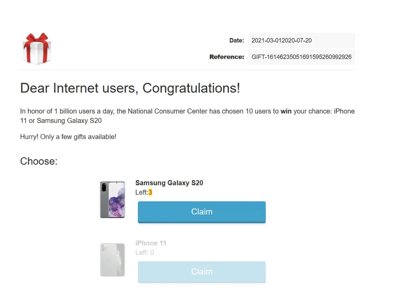
Biases are distortions of judgment that occur in situations deemed to be unconsciously uncertain. One of the most common biases that can be exploited with online ads is certainly the Loss Aversion one. This principle is based on the assumption that people are more motivated to act to avoid a loss than to make a profit. On this landing page, we can see an excellent example:

(img. 6) The “only 3 units left” is a good example of a loss aversion bias that could increase the click rate.
Another example of a very easy-to-use bias is the so-called Bandwagon effect. This bias refers to people’s tendency to adopt a given behavior because that is what others do. It is based on the assumption that man is a social animal and has the tendency to “follow the flock”.

(img. 7) “More than 150k are playing” is the same as saying “do it because another 150k do it”
Finally, that bias that makes us give greater importance or value to the easier information available is called Salience bias. A clear example below:
(img. 8) The strong contrast between the landing page’s colors and the call to action makes the user focus on the only important action, the click.
Perceptual sets and expectations
The perceptual sets idea refers to the predisposition of human beings to perceive things in a certain way, based on the context. In fact, our expectations of something can vary depending on the way we interpret the data according to our point of view. Like in the following example:

(img. 9) The user will be intrigued by receiving a “hot” photo and a voice message from an unknown woman. Based on how the notification looks, he (or less likely in this case, she) will click on the creative because he will expect to hear the voice message.
How to make users buy with psychology
One theory to keep in mind when building a funnel is the Freytag pyramid. Creatives and landing pages must have the goal of telling a story, the culmination of which will be, finally, conversion.

In order to make our storytelling work, we should make sure that each element of the pyramid corresponds to an element of the funnel:
| inciting incident -> creative climax -> landing page/pre-lander resolution -> conversion |
Once the story is built effectively, we can enrich it with some interesting strategies that are likely to increase conversions.
As we have already seen in the case of saliency bias (img. 8), colors have a strong effect on the human psyche.
When developing our funnel, it is good to connect these kinds of natural associations of our brain with the message we want to communicate.
For example, the color red communicates urgency and danger. In the case of antivirus offers, red is a very used and effective color, as we can see below:
Psychological pricing is another weapon on which to pivot when you want to persuade the user to purchase. In fact, in the case of a discount, it strengthens feelings that the human mind tends to give very strong responses. These can be emotions such as fear, irrationality, injustice, or heuristics such as scarcity and loss aversion.
BONUS TIP: How to convert 1 click offers using psychology
Related to what we have discussed so far, I share an interesting tip that I have extensively tested in my media buying strategies.
Thanks to various tests conducted on 1-click offers, I have been able to convert any offer related to streaming services (but I have noticed it also works well with games and PIN submit offers) with dating angle creatives that make the user believe in having received a video. As in the case of this offer for Pakistan:

This technique exacerbates the concept of perceptual sets we have talked about, making the user subscribe to the offer in order to see the received video.
Want to talk psychology? Join our Telegram chat and speak to REAL affiliates.


