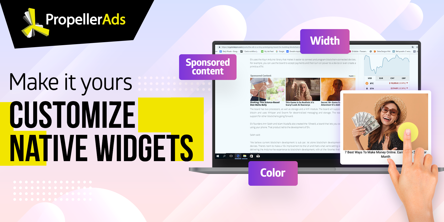
Make it yours. Customize Native Widgets

Publishers have a very limited time (and space, of course) to make an impact and monetize their users; which means that publishers have to focus on being savvy about how they drive value from their online audience.
We’ve talked a great deal over the past few months about Native Widgets and how publishers can benefit from using this monetization format.
By the way, here’s a case study on how one of our publishers managed to increase his earnings with Native Widgets.
Now it’s time to talk about customization. Great news – now you can FULLY alter the way native widgets are displayed so they would feel tailor-made for your website.
Have a look at your new toolkit:
What can you customize?
In short: everything. But for those of you craving for details, let’s talk about all the native widget settings you can play with:
- The number of columns and rows
- Widget width
- Background color
- Font, font color, size
- Image dimensions
- Responsive or not
- Hover options
- Headline options: “From the web,” “Recommended,” Sponsored content”
That’s a lot, right? The next step is to find out why customization is a must when you monetize with Native Widgets, and what to do with all these options.
Getting to the “Why” part
If we describe it in the form of a mathematical equation: Positive user experience = Higher monetization income.
Reason #1: Profitability
Well-designed ad widgets positioned in strategic areas of your website do increase the number of clicks, making your monetization efforts more effective.
A widget that is just a tad too ugly or doesn’t go with your particular design, can psychologically deter and discourage users from clicking. Making them perceive ads as less valuable, thus, decreasing the click-through rate (read: your money).
Pretty looking ad widgets are irresistible:
Reason #2: Simplicity
We made sure that our new widget customizer is incredibly simple – with a little effort, you can modify the appearance of widgets to match your website design seamlessly.
Not just size: you can even go all the way to font attributes! There’s no need to fix the code manually – everything can be conveniently done via simple interface – you see the widget preview right away and can make changes on the fly.
Reason #3: Perfect for testing
You already know that monetization is all about testing, and the new native customizer can help you test your widgets in a more quality way.
- How many blocks are the optimal number for your website?
- What image dimensions bring the highest CTR?
- Should the text be bold?
- How does the background color affect user experience?
- Etc.
In other words, there are dozens of parameters you can adjust and find the best-performing combination for your website.
Have you already customized your Native Banners? Where do you usually place them?
