5 Tips on How to Make Your Ad Banners More Clickable

Banner ad blindness is not a myth, but a real problem in the marketing industry. However, in this article, you’ll learn how to strategically implement banner ads so that the clickthrough rate (CTR) is profitable. There are proven methods that top tier marketers use today to get high returns on their banner ad campaigns.
Check out these actionable tips to improve the CTR of your own banner ad campaigns. Implementing these 5 tips below could potentially turn a losing banner ad campaign into a profitable one.
1.Chose the right size
It has been statistically proven that some banner ads are more effective than others at getting a clickthrough. The most common sizes are as follows:
- Large rectangle – 336×280px
- Medium rectangle – 300×250px
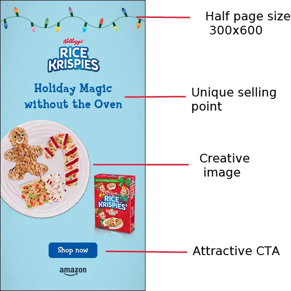
- Half page – 300×600px
- Leaderboard – 728×90px
You’ll see these banner ad sizes everywhere, but that doesn’t mean they are the right sizes to use. It’s important to carry out your own testing to see which ones provide the highest rate of conversion. Based on a sampling of 20 million impressions the most effective ad sizes are leaderboard, wide skyscraper (160×600) and inline rectangle (300×250).
Starting off with these banner ads in your marketing campaign is a no-brainer.

Read more: Mobile Interstitial Ads are now available in Self-Serve Platform!
2.Call to action
The call to action (CTA) is a vital component of a banner ad. Without it, you’ll struggle to persuade website visitors to take action on the banner ad. A banner ad call to action is rather simple and requires the minimal amount of copy.
For instance, you can use wording like “Watch Now”, “Get Started” or “Learn More”. There is nothing complicated here, but you must ensure the CTA stands out in the banner. The font size and color of the CTA is what’s going to make the difference.
You should also run A/B split testing campaigns to try out different CTA’s for the same offer. This allows you to figure out which one yields the best results. When running A/B split testing make sure that you get a good enough sample size before making any conclusions. Perhaps 10,000 impressions will be a good enough sample size to make a decision.
3.What’s the benefit?
You must convey the benefit to the user for clicking the ad. For instance, if you’re selling a weight loss program then you need a unique selling point. It could be that it’s targeted at 30-50-year-olds. In that case, it’s beneficial for such an age group to click on the ad because the course is targeted towards them.
The benefit is usually the same as the unique selling point (USP). For any company having a USP is a must to compete in the marketplace. You don’t have to invent anything, but position or frame yourself in a unique way.
A visitor wants to get value from any website that they visit. It doesn’t matter if it’s a banner ad that’s going to provide it or any other element of a website. Using copywriting and images is a great way to illustrate what type of benefit is in it for them.
4.Use animation
A banner ad that’s based on animation rather than statistics provides a higher clickthrough rate. You should not loop the animation more than 3 times because the repetition can be off-putting to the website visitor. Also, there is not much additional benefit to the viewers by looping it more than 3 times. If they didn’t notice or appreciate the ad in the first 3 loops, then it’s likely that something is going to change with more loops.

As well, each loop should not last longer than 15 seconds. The longer the loop, the more it costs to create the ad because additional resources are required to design it. Also a longer loop means the user needs to view the ad for longer. The average attention span of online users is dropping. Therefore, getting them to fully view longer loops is going to be a challenge.
For businesses that don’t have a graphic designer to create the animation for the loop can outsource the process to a freelancer. There are plenty of freelancer sites where hordes of individuals are waiting for more work right now. With such a large pool of potential candidates, there are some outstanding designers at competitive rates.
5.Credibility
Even if they have never heard of the company behind the ad, there should be a sense of credibility. Therefore, do not make claims on the ad that you cannot back up right away. There are plenty of laughable banner ads that state things like, “Make $10,593 in 3 days working from home”. Because of this, the skepticism meter is at an all-time high for the average internet user.
Use notable studies, or icons such as Warren Buffet or Michael Jordan if they are relevant to the ad. Leveraging industry related celebrities and notable brands in the banner ad will greatly increase the credibility factor.
You can hire out the copywriting to professionals or an essay service when you have no idea what to write. Achieving a sense of credibility takes experience as a copywriter. If you lack such an individual in-house, then don’t go with what you have. Explore the options out there to increase your chances of success.
Conclusion
Even today a banner ad campaign can still bring plenty of targeted traffic to your website or landing page. The recipe for success is getting the details right, and the 5 tips above will help you do that. Implement them all to obtain the maximum ROI possible for your banner campaign.
Furthermore, this article is just one piece of the puzzle. There are plenty of other strategies you can implement to boost the conversion rate even higher. In marketing, it’s important to experiment for yourself to see what works for your specific brand.


