5 Reasons Why Users Don’t Convert: Last-Minute Failures and How to Beat Them

This post is also available in:
PT
ES
We already shared our insights on low conversion rates: when something is wrong with the traffic you are sending to an offer. But let’s suppose it’s all perfect: you target the best suitable audience, your banners can boast sky-high CTRs, and your offer is unbeatable.
What can go wrong then? Why a warmed-up user who deliberately clicked on your ad slips away? Let’s try to find out and share what we know from our customers and dear sales team.
User experience is not so smooth
Some landing pages are a mess — and we bet yours is not. However, even a great landing can become a conversion killer if you miss some important points that may repel a user and make them leave. What are they?
Unusual navigation. Being innovative is very welcome in marketing — but sometimes it doesn’t pay off. Keep it simple and don’t reinvent the wheel: scrolling down is the best solution for most websites. It’s just what users are used to doing — let’s not confuse them!
Non-working elements. Your customer was like ‘Say no more, I’m taking this!’ — and really wanted to install an app, purchase weight loss pills, or register at an iGaming website. However, your CTA button wasn’t active or a registration form failed to sign up a user.
No mobile screen adaption. Are you sure your landing page looks the same great on a mobile device? Take your time to check it. There are many tools allowing you to make sure your offer is mobile-friendly — and your own smartphone is also one.
Auto-played videos. Nobody wants to watch a video they didn’t ask for. Most users will close the whole page instead of muting your clip, so make sure your landing is not disturbing.
To sum up:
- Stick to classical navigation and keep it simple
- Make sure everything works fine
- Mind the mobile audience
- Avoid being too intrusive with auto-played sounds and videos
Your page doesn’t inspire trust
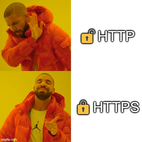
Would you install an app that may contain malware? Or share personal details/credit card numbers with a site that doesn’t look secure? Not all users are very picky and know how to tell a trusted site from an unsafe one, but it’s not a good idea to count on that. So, make sure your site looks fair and protected — and that it is really so, of course! It especially matters when you work with FTD and CPS conversions.
However, not all customers are so Internet savvy, so you might need more proof. In other words, you need to handle a customer’s objection ‘What if it’s a fraud’? This is how you can do it:
Add positive reviews, testimonials
Anything we call social proof. It can include reviews, testimonials from satisfied customers, or some stats like ‘an app was downloaded N times’. Here are some examples:
Mention guarantees or money-back features
Do it, if your offer implies some.
Promise to keep data safe
And do it in simple words:
To sum up:
- Make sure your landing page is protected
- Show it to users very clearly
You make a user perform too many actions
Imagine you saw a fishing rod you’ve always wanted to have. You grab it straight off the reel and rush to a counter: all you want is to pay for it and happily leave. However, a store assistant begins to pile you with questions: ‘What is your name?’ ‘Where are you from?’ ‘What is your phone number?’ — and so on.
This made-up example is obviously exaggerated, but it’s something similar to what you can accidentally do to users when collecting their data. Of course, if you are paid per lead, you can’t avoid asking a user to fill out some form or register at a site — but make sure you are not overwhelming them.
Here are some practices that can help:
Break down the full set of questions into smaller parts. Don’t frighten a user with a long list of questions: create several steps instead:
Use visual elements to make the form more engaging:
Check the user journey at the offer. Some offers imply a mandatory registration at a product owner’s website or again imply filling out too long forms. It may repel users too. Keeping the registration form practices in mind, go through the full user journey before you start working on the offer.
To sum up:
- Make a form clear and convenient to fill out
- Don’t stick to offers that have complicated requirements for leads
An offer doesn’t have enough payment options
So you need a user to submit a credit card, make the first deposit, or simply buy a product. A user will obviously want to use their favorite payment method — and might leave if you don’t have one.
The only solution here is to have as many payment options as possible — or at least accept the most popular ones for a particular GEO. However, it’s not you who accepts the payments. What can you do?
The only way is to do research before sending traffic to an offer. Whatever it is — an iGaming site, a paid app, an online store — check the available payment methods for customers to decide if the choice is good enough for most users to convert.
To sum up:
- Do your homework before you take an offer. Check what payment options are available for a product you promote.
The call center is not on your side
Some conversion types are very complicated. For instance, the ones when you are paid only after a user makes a purchase and gets a purchase delivered. It means that your part of work is over when a user left their contacts — and a call center enters the stage.
Just like in our previous tip, much depends on how you research an offer. Read forums, contact CPA network managers, or simply speak to the call center yourself as if you were a client. In other words, get enough information on how the call center and sales managers deal with orders. Some large media buyers even have their own call centers to have control of the entire sales channel.
To sum up:
- Be careful with COD offers and make sure a call center does its best to make conversions.
Final words
Try looking at your offer as if you were a user. Yes, you can’t please every single lead from your overall traffic — but there are some pretty evident party killers that spoil things more often than the others. What else? Give yourself a second chance, collect the whole audience, and set the Retargeting: let them see how you improved.
Do you have more ideas why users don’t convert? Share them in our Telegram chat!
