App Store Optimization: How to Do It Right? [With Real App Owners Experience]
This post is also available in:
PT
So you have an app, and you are sure it’s worth a million downloads. We believe it really is — but how to prove it to million users?
The first great idea is to promote your app via social media or ad networks. We at PropellerAds, have plenty of apps campaign case studies with inspiring conversion rates (we got proofs, so read on).
But there’s also another vital piece of work you must do: it is ASO or App Store Optimization.
In a nutshell, ASO is about making your app visible for organic search inside an app store. However, it’s a much more complicated story, which we will tell you right now.
By the way, we didn’t want to only load you down with lots of theory! So we asked Ilya Pasyuk, a Product Owner at app development startup AppLabz, to share the real ASO experience and show something behind the scenes of app marketing.
Okay, here we go!
What is App Store Optimization, and Why Do You Need It?
App Store Optimization is often associated with Search Engine Optimization (SEO) — improving a website to make it rank higher in Google search results, and so bring organic users. Basically, this comparison is legit enough.
Both SEO and ASO specialists are striving for higher visibility and first positions in search results. And, the basis of both SEO and ASO is written and visual content, including relevant keywords.
In very simple words, App Store Optimization is the process of boosting the app’s visibility in a store and making it attractive for downloading. ASO efforts include creating catchy titles and descriptions and appealing visual elements on the app’s page at App Store or Google Play.
We mentioned paid traffic before, and you might ask: why should I care about ASO when I can get installs and active users with, say, a PropellerAds campaign?
Of course, you can. And, if you set your campaign right, using our formats and tools to the full, you most likely will. However, there are two good reasons why a wise ASO strategy is essential anyway:
- ASO brings you additional traffic, so why narrow your audience? Besides, organic users tend to convert better.
- Selling texts and high-converting images are also essential for your paid campaigns. The page of your app in the store is at the bottom of your funnel — so it must look as attractive as your pre-lander or banner creative.
Ilya Pasyuk: bringing your app to the top of the search results requires a range of factors: app rating, number of downloads, conversion rate, etc. And, what is more, the app will have different search positions depending on the GEO. Finally, there are some search specifics for every particular user — so, as you see, a fight for rankings in, say, the top 100 Utility Apps list is very exhausting and not always necessary. Our final goal is conversions, after all. Thus, ASO helps to make an app visible enough for organic users and turn it into an appealing offer for paid traffic campaigns, too.
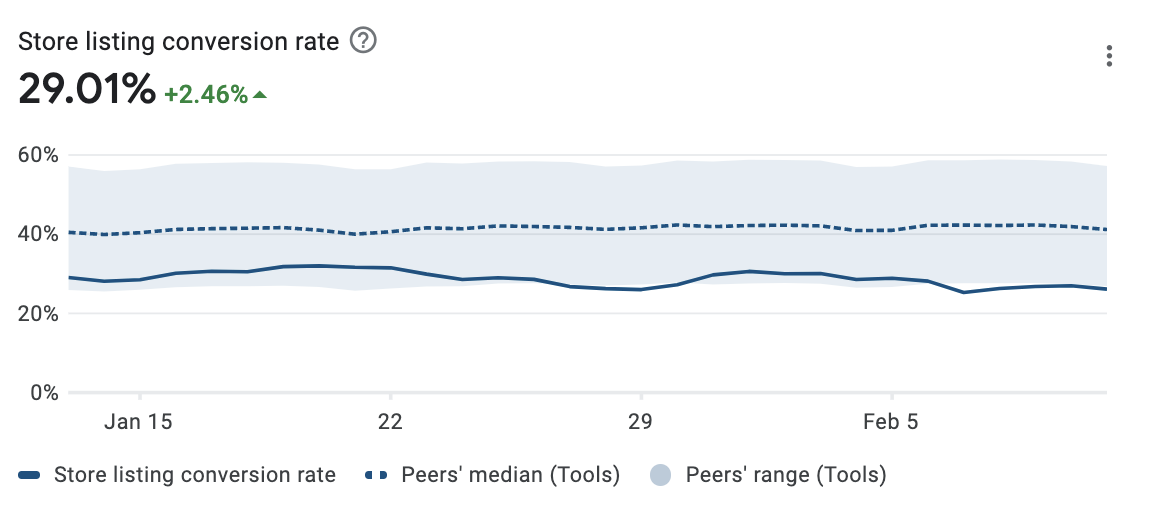
This is how you can track conversions in Google Play developer’s account: check your CR and compare it with the industry average benchmarks:
ASO Quick Guide + Best Practices [AppLabz experience]
So you are ready to start your first ASO efforts. Before you dive in, note that it’s a long-term strategy. We mean, you shouldn’t expect a large regular stream of users immediately. The first results might delight you in about three months, so patience is your first tool.
What about the other tools and techniques? We will show you a traditional ASO strategy — most specialists agree it’s evergreen. And to make it vivid, we also added some real practices from AppLabz — let’s see how it works in action!
And the first thing you should do, is…
Searching for Keywords
Organic users find your app by typing some keywords in the search field. Like this:
So, your task is to add these keywords to your app title, subtitle, and description. But how to find the most relevant ones?
Here is a quick checklist:
- Analyze your competitors. What keywords are they using? Which keywords are giving them the best positions and the most downloads?
- Choose the best keywords. You don’t need to squeeze all the potential searches into your texts. Experts recommend using from 5 to 10 most popular keywords.
- Think of what people will do with your app and use it for your semantic core, too. For example, if your QR scanner can create QR codes for social networks, it will be nice to have words like ‘Instagram,’ ‘Facebook,’ or ‘Twitter’ in your texts. And, when a user types in ‘generate a Twitter QR code,’ your app will be ranked for this keyword, too.
But how do I know which keywords are popular and which are not? Let the software do it for you.
Tools you can use (checked and recommended by AppLabz):
- Sensor Tower — a set of various solutions for digital businesses, including a keyword planner for apps. It analyses keywords via a competitive analysis and creates a semantic core (set of the most relevant and popular keywords).
- ASODesk — one of the top popular organizations providing tools and services for ASO. Among their products is a keyword planner, too — with various stats and monitoring of top search positions.
- Manual research — not the most efficient, but at least always affordable option. Just enter your app’s main keyword, for example, ‘QR scanner’, in the search bar in a store, and analyze the top results.
Creating Text Content
Equipped with the best keywords, you can now get to the creative process. Your task is to write texts for your app describing its features, and don’t forget about naming, too!
A tricky part: your text has to contain keywords but be careful not to overstuff it with them. Your copy must be attractive for users, not only engines — otherwise, you risk getting something like this:
| Best app for meditation. Meditation app for well-being, health, and yoga. Mindfulness mediations, sleep meditations, guided meditations. Meditations, meditations, meditations, and meditations again. |
Got it? And, another note: if you are going to release your app at both App Store and Google Play, you will need to prepare different texts for each.
Why so?
At least because App Store and Google Play have different app page structures and symbol limitations. Besides, the stores have a different approach to ranking apps. A search engine of each store uses keywords from particular text fields, but not all of them.
So, some of your texts must be wisely mixed with the top keywords, while the others will serve exclusively for marketing purposes and aim only at the users, not the search engines.
A picture is worth a thousand words, so let’s just look at some screenshots.
Here is how an app looks at Apple App Store:
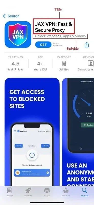
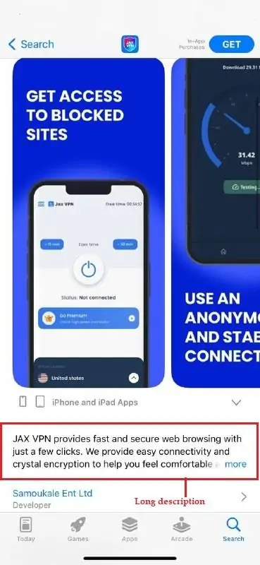
As you see, you need to add the following elements:
- Title: visible in search results and contains keywords.
- Subtitle: also visible in search results, contains keywords and shortly describes your app’s best features.
- Long description: visible in a shortened form with a ‘more’ unfold button. App Store doesn’t use this description in its rankings, so don’t try to play with keywords much here: instead, focus on the selling power of your copy and create a strong call to action.
- Keywords: not visible to users but make a significant impact on your ASO. You can add your most relevant keywords in a special field of your developer’s account.
Now, what’s with Google Play? It’s not the same!
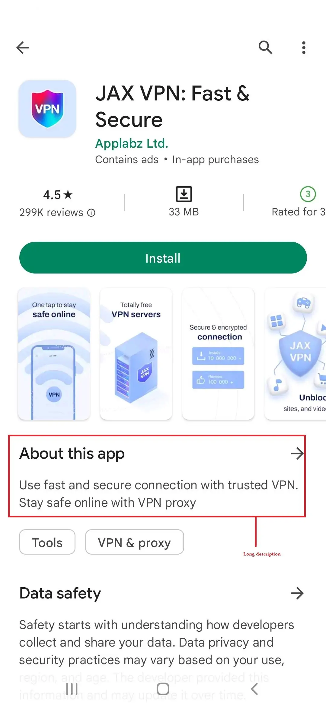
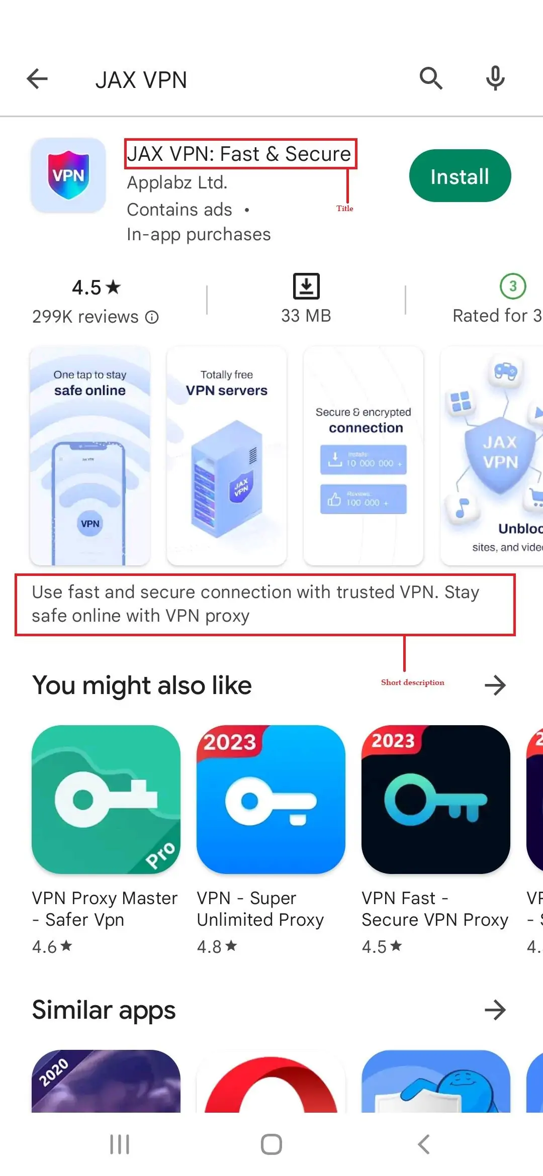
- Title: visible in search results and contains keywords. However, there is no subtitle, like in the App Store. So, if the top features of your app are not quite clear from its name, make sure you add them in the title for Google Play.
- Short description: visible only in search results. It impacts the rankings, as Google Play, will recognize your keywords from it when a user does a relevant search.
- Long Description: Not visible in search results but available for users on the app’s page. Similar to App Store in character limitations and marketing purposes, Google Play’s long descriptions have a very significant difference. The store will use your keywords from it to rank your app.
- Keywords: Google Play doesn’t have this field, so it’s an exclusive Apple feature.
Here is a brief summary of what we’ve just said. The green ticks show the elements that affect your rankings and must contain keywords:
| App Store | Google Play | |
App title | 30 characters ✅ | 50 characters ✅ |
| App subtitle | 30 characters. Appears under the app title in the search results ✅ | – |
| Short Description | – | 80 characters. Appears only on the app page ✅ |
| Keywords | Up to 100 characters. Added to a special keyword field invisible to users ✅ | – |
| Long Description | Up to 4,000 characters | Up to 4,000 characters ✅ |
To give the copy topic a final touch, we’ll give some general tips and practices for texts and keywords:
- Mind GEO specifics. Your texts for India might have a completely different call to action and selling points than the ones for, say, France.
- Google Play loves it when you repeat keywords in different fields: for example when you use the same keyword in a title and a short description. App Store doesn’t care about it, so don’t try to gain this machine’s favor this way.
- Make sure you have a professional translator on hand to localize your texts correctly and avoid weird language mistakes.
Adding the Visual
Your app description also contains visual elements.
- The app’s icon
- The app’s screenshots
- The video – optional
And all of them are optimizable, too — and again, each has its own specifics in both stores.
Icons
The technical requirements are easy here: iOS requires a 1024×1024 square picture, and an Android app icon must be 512×512.
What is more complicated is the picture itself: what will be on your icon creative? It stays totally up to you, but for good ASO, it should be a very clear picture representing what your app is about.
Some app owners put a logo of their company on the icon, but it’s not the best idea if your brand is not famous and recognizable yet. Make it straightforward: sell flight tickets? Draw a plane. Offer a VPN? Let your icon show it clearly.
Screenshots
An essential part of your app presentation is screenshots and videos showing the app’s best features.
Ilya gave us some recommendations for them, too.
- The first screenshot must be the most eye-catching one. Users rarely scroll all the screenshots, so you must grab their attention immediately.
- Recommended tools for creating and editing screenshots: Canva, ASO Desk, Figma.
- Don’t forget to localize your visual. Sometimes, the same app might look completely different for various GEOs.
- A/B test, and A/B test again! Split tests of your creatives are vital for optimizing your ASO strategy.
Here is an example of one from AppLabz: split tests of how different visual versions convert for Scanero, a QR code scanner app. Scroll the gallery to check out creatives and the test results:
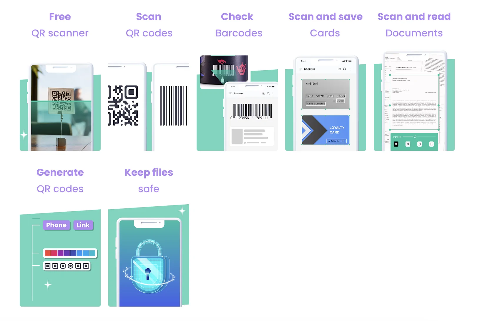
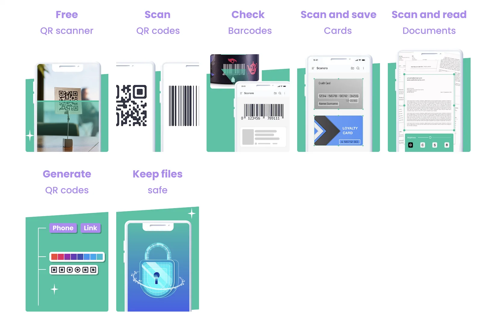
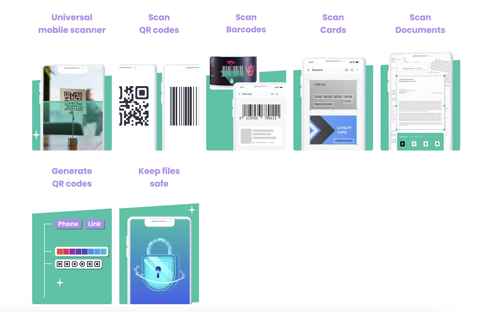
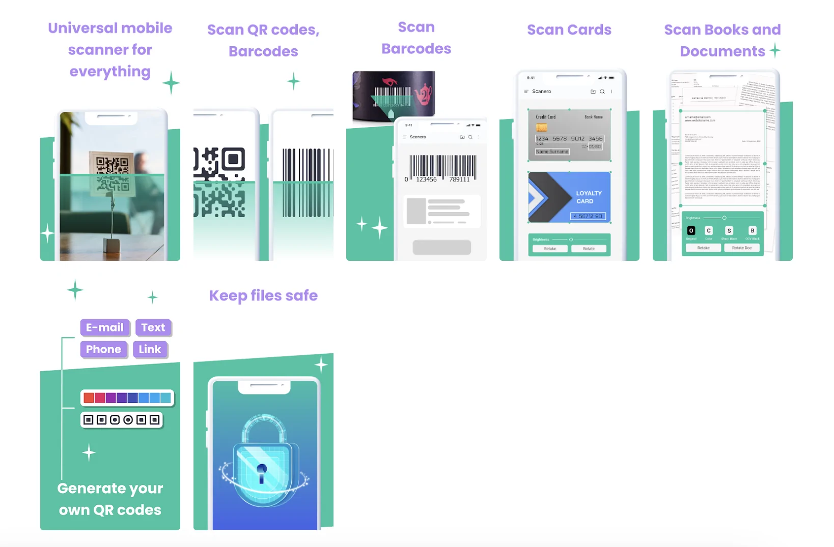

As you see, the only thing that was changed in all screenshots is the text — and we think we have just proved that what you write in screenshots is important, too.
Ilya Pasuyk: Sometimes, A/B tests show that there’s no significant difference between two or several icons or screenshots. However, it doesn’t mean you shouldn’t test at all.
Working With Reviews
So your app is ready to go! But it’s too early to relax: you now have some more work to do.
Your new ASO tasks are coming right from your users now. How in the world? Of course, reviews!
The number of reviews and overall user rating affects your search positions. Yes, this is why almost every app sends you a ‘Rate us’ notification from time to time. As an app owner, you need to work with reviews thoroughly, create personal replies with keywords, and take some insights about the further improvement of the app.
Reviews are text content, too, right? And the good news is that they are indexed by application store engines as well. While you can’t (unfortunately) make customers write reviews using your top-ranking keywords, you can create ASO-wise replies! See how it works:
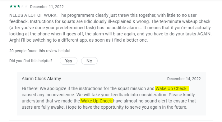
In this example, we see a whopping two ASO tricks: first, developers apologize for the inconvenience and show that they care about customers. It doesn’t rank the app higher, but makes a good impression on the app page visitors and boosts conversions!
The second trick is using keywords: see how smoothly they added this ‘Wake Up Check’ feature, which is a pretty popular search request.
Ilya Pasyuk: Sometimes, an app receives pretty unfair reviews. It may happen, for example, when a user doesn’t understand how the app works but claims that ‘nothing works at all.’ Besides, there might be some GEO issues — for example, when a barcode reader can’t scan codes in a particular country because of the different ISO standards. If you can give a brief explanation — don’t miss this opportunity.
How to Boost Your ASO With Paid Traffic [Case Study From AppLabz]
So suppose your ASO is perfect and you collect plenty of organic users. How to boost all your metrics? Of course, with paid traffic. Here is one of the recent case studies AppLabz shared with us.
| Offer: Scanero App: QR code scanner GEO: Indonesia Ad Format: Onclick |
We already showed you those thorough A/B tests for Scanero visuals — so, as you might guess, the rest of the app’s page is optimized according to all the guidelines.
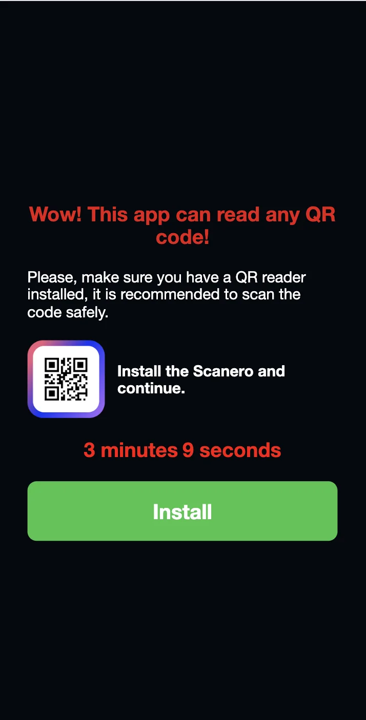
The app is available worldwide, so AppLabz created separate campaigns for different GEOs. This one for Indonesia uses a simple Popunder pre-lander:
And here is how the campaign converts within a week:
| GEO | Impressions | Conversions | CR | CPM | Profit | CPA |
| Indonesia | 323,480 | 25,975 | 8,03% | $1,321 | $1427,567 | $0,128 |
We think there’s nothing left to say but ‘Good luck!’. And, of course, you are welcome to join PropellerAds and see your app conversions grow.


