Where to Place Native Banners On Your Website?

Have you noticed? Every year online marketers discover new strategies and formats that are believed to be more effective.
We have a great example, as we have recently launched a new type of native ad format for our publishers: Native Banner ads.
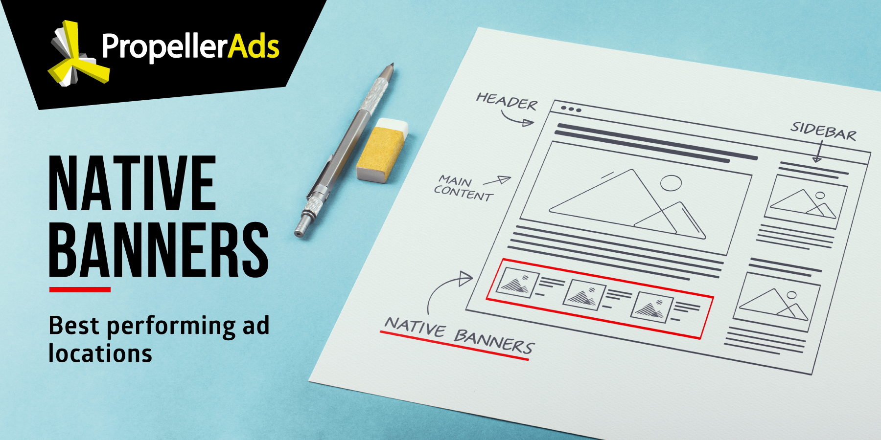
Native banner ads come in the form of widgets, which makes them extremely versatile. As you can imagine, these can be blended with regular website content in order to reach customers without raising any alarm.
But, you also have to invest time in optimizing the native banners on your page and giving them the best chance to be seen.
Why is Positioning So Important?
Simply put, the positioning of your ad will determine how many people interact with it. And as a publisher, the more people click on the ads on your page, the more money your site can potentially generate.
This is a very good reason why publishers should try to find the best placement on their sites for their native banner ads. Forget about advertisers who are interested in paying for impressions. Advertisers want to see interaction.
Identifying the Best Areas for Native Banners
Like most forms of advertising, most industries have unique requirements. You should review your page, audience, and the industry in which your advertisers operate in to find the best setup for your native ad.
Google recommends asking yourself the following questions:
- What is the user trying to accomplish by visiting my site?
- What do they do when viewing a particular page?
- Where is their attention likely to be focused?
- How can I integrate ads into this area without getting in the users’ way?
- How can I keep the page looking clean, uncluttered and inviting?
That being said, there are two concepts that can be applied to identify the best placement for virtually any native banner ads. These are:
Visible Parts of Your Site
Always remember that your native banner ad should be in a visible part of your website. Placing your ad “above the fold” or in the upper-most part of your site will improve the odds of your banner being noticed.
Above the fold is the portion of a Web page that is visible in a browser window when the page first loads. The portion of the page that requires scrolling in order to see content is called “below the fold.”
You have to be very cautious with native banners because they are designed to smoothly present an ad to a user. If the ad is too obvious, users will see through it and lose interest right away. If the ad is not well-positioned, users will simply ignore it, so finding a balance is critical to the long-term success of your site.

Most Popular Pages
The most popular pages on your website are the ones that attract the most traffic (and generate more money). This increases the exposure the ads on your site get, thus improving the probability of landing an interaction.
Despite the fact that your most popular pages may not have the highest CTR, they will likely generate the majority of money that comes from your site. Moreover, native banners that have the highest CTR are almost always located on the home page, so don’t be surprised if this is the case for your site.
Make sure to place ads on all entrance pages of your website.
Also, note you should take the chance to show off your content. Instead of taking up the entire area above the fold with an ad, show your title and the first paragraph of your content. At the same time, you should look to place the native banner in a “natural” position to give your page a sound structure.

Improving the Performance of Your Native Banner Ads
In addition to the placement of the native banners, publishers can also implement other techniques to help advertisers improve their CTRs. These include:
General Location
Despite the fact that ads placed above the fold perform better, you may decide to place several banners on a single page. In these cases, employing a heat mapping tool like Crazy Egg can help you establish the areas of your site that attract customers the most.
You can also try HotJar, Inspectlet or Mouseflow.
At the same time, tools like Crazy Egg also give you valuable insights into your visitors’ behavioral patterns. These include the areas of your pages that see the most interactions, the least active parts, and the source of the traffic, just to name a few.
Content Blocks Per Widget
Having 3 to 4 content blocks on each widget will give you enough space to showcase an image and a creative title without cluttering your pages.
Remember that this number may vary depending on your preferred vertical and audience, but anything above 10 blocks per widgets tend to drive down CTRs.
Size and Coherence of Your Ads
As with most native ads, banners should be coherent with your site in all senses. In other words, it should maintain the same size as the standard banners and other elements on your site. It should also have a similar color scheme when applicable as well as the same font and general style.

Quick Tips for Popular Website Types
Native Banner ads make a great fit for almost all sites and verticals. Let’s see where you can place Native Banners, depending on your website type.
- Blog and News Outlet
Blogs and news outlets are ideal for banner ads because users are used to seeing arbitrary content in a variety of formats. Creative banner ads tend to work wonders on these sites, as long as they feature attractive content and appealing graphics.
Native banner ads placed on these sites should mimic authentic content, but it can be placed above the fold, in-content, or in any of the sidebars on the page.

- Video Streaming Websites
Live and recorded video streaming sites also make a great choice for Native Banner ads, for similar reasons to news outlet websites. However, it’s worth noting that sidebar ads don’t perform well on these pages.
For this reason, we suggest you place your banner ads either above or beyond your video player, where it has plenty of chances to be noticed by users.

- Online services / Tools
These websites can benefit from placing Native Banners on “Thank you” pages. For example, after a user has downloaded / converted a file, he is landing on a “Thank you” page, where the attention can be focused on the ad.

Still have questions? Great! Please leave us a comment in the section below or contact our support via Live Chat.

